A desktop for the web, in React: windows that fill the desk, layered, and arrange when asked.
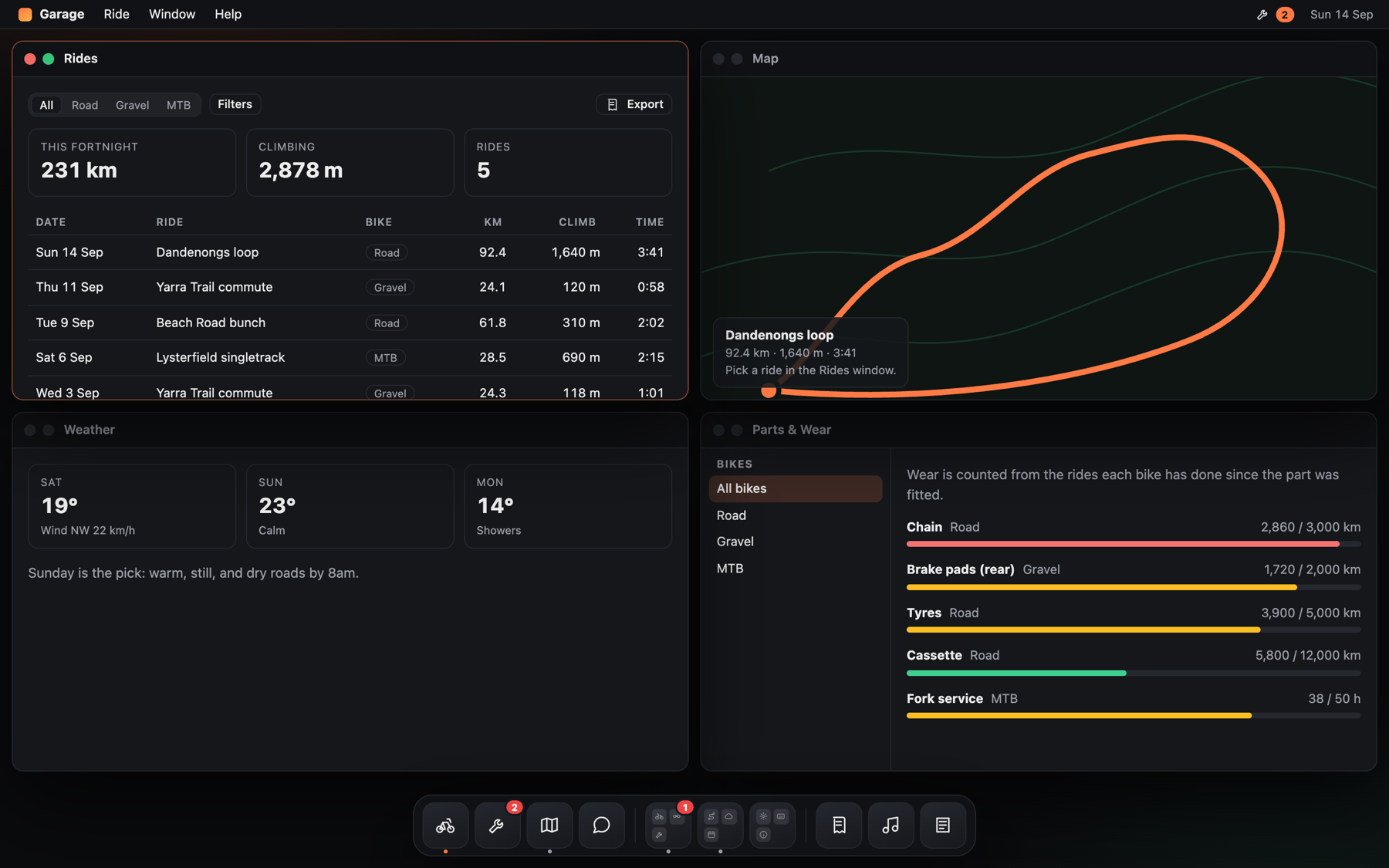
The examples/garage sample, after Window → Arrange. Every screenshot below is that same sample — run it with npm run example.
npm install @liberation-data/deskEvery window opens filling the desk, over the ones already open, and keeps filling it when the browser resizes. Nothing is laid out behind anyone's back.
Window → Arrange (⌥⌘A) lays the open windows out once: two side by side, three one tall and two stacked, four a grid. After that they are ordinary windows. Move or resize one and only that one changes.
Drag a window by its title bar to free it where it sits. Drop it against the left or right edge and it takes that half. Resize from the sides, the bottom or the corner. Double-click the title bar, or press the green control, to fill the desk and back.
Windows survive the desk changing size. Unplug an external display and the ones you spread across it are past the edge of the laptop screen, where nothing can drag them back — so they are brought in, shrunk if they must be, and a window too small to be one fills the desk instead. Plug the display back in and each goes out again exactly as it was. Move one yourself while the desk is small and that is a decision, so it stays where you put it.
When more than one window has to be made smaller, the layout itself is gone — each was clamped on its own, so windows that sat side by side now sit on top of each other — and they are laid out the way Arrange would, for the screen there is now. The frames from the big screen are still remembered, and come back with it.
A mounted <Desktop> watches its own size and does all of this. Without one, call
desk.fitToStage(): it returns which windows it moved, squeezed and restored.
Give the desk somewhere to keep layouts and windows come back the way they were left:
const desk = createDesk({ layouts: localLayoutStore('rides') })A window you made small and moved to a corner opens small and in the corner next time; one you zoomed opens
filling the desk. It is remembered per kind of window, so query#2 opens where query was left. If the desk
has shrunk since, the window is moved back on and made smaller, and opens filled if it would be too small to
use. Another window of a kind already open steps down and to the right of it, wrapping to the top-left at the
edge. Arrange and a frame passed to open are not remembered. LayoutStore is two synchronous functions,
load(type) and save(type, layout), for keeping layouts somewhere other than this browser.
import { createDesk } from '@liberation-data/desk'
import { Desktop, DeskProvider } from '@liberation-data/desk/react'
import '@liberation-data/desk/desk.css'

const desk = createDesk()

export function App() {
  return (
    <DeskProvider desk={desk}>
      <button onClick={() => desk.open('notes')}>Notes</button>
      <Desktop
        title={id => TITLES[id]}
        renderWindow={id => SURFACES[id]}
        empty={<p>Nothing open</p>}
      />
    </DeskProvider>
  )
}
Two windows onto the same thing are the same kind with different ids: desk.openInstance('query') gives
query, then query#2. windowType(id) says what to render; the whole id says which one it is.
A window's code can wait until the window opens, and each window loads and fails on its own:
const RoutePlanner = lazyWindow(() => import('./apps/RoutePlanner'))While it loads, that window says so and the rest of the desk carries on; if it cannot open, that window says
what went wrong and offers Reload, which tries the import again rather than remembering the failure.
<Desktop loading={…} failed={…}> replaces the wording.
renderWindow is called with a window's id. The desk never owns your content, and a window keeps its DOM
when focus moves, so scroll positions, carets and iframes survive.
<Desktop
  title={id => TITLES[id]}
  limits={id => (id === 'about' ? { maxWidth: 720, maxHeight: 560 } : null)}
  renderWindow={render}
/>
Most windows want the whole desk when filled and whatever they are dragged to when free, which is
what null says. A window whose content has a natural size — an About box, a short form — says so
and is never stretched past it, however it is filled, arranged or dragged; filled, it sits in the
middle of the room it was given rather than in a corner of it. minWidth and minHeight work the
same way.
<Desktop
  title={id => TITLES[id]}
  note={id => (id === 'logs' ? 'GET /api/v1/admin/logs' : null)}
  renderWindow={render}
/>
info puts an (i) at the end of the title bar, holding what this window is. Every window that has one
keeps it in the same place, so somebody who wonders what they are looking at always knows where to ask;
a window with nothing to explain has none. Explanation only, as with InfoTip — a warning belongs in the
window itself.
note puts a quiet line on the trailing side of a window's title bar: the request behind it, the file being
edited, how many rows were found. It is text, not a control — the title names the window, the note says what
this one is looking at, and in a narrow window the note is cut before the title is. Return null for a window
with nothing to say. Controls belong in actions, which sits after it.
<Desktop layout="auto"> (the default) reads the device. A touch screen that cannot hover gets
fullscreen: the key window fills the stage, the dock stays as the way to switch, and windows are not
moved or arranged. Windows you are not looking at stay mounted — their drafts, scroll positions and carets survive —
and are simply offstage and inert. A tablet with a trackpad reports a fine pointer, so it gets the
desktop. Pass layout="desktop" or layout="fullscreen" to decide for yourself.
Links work the same everywhere: a link opens the same windows, shown one at a time on touch.
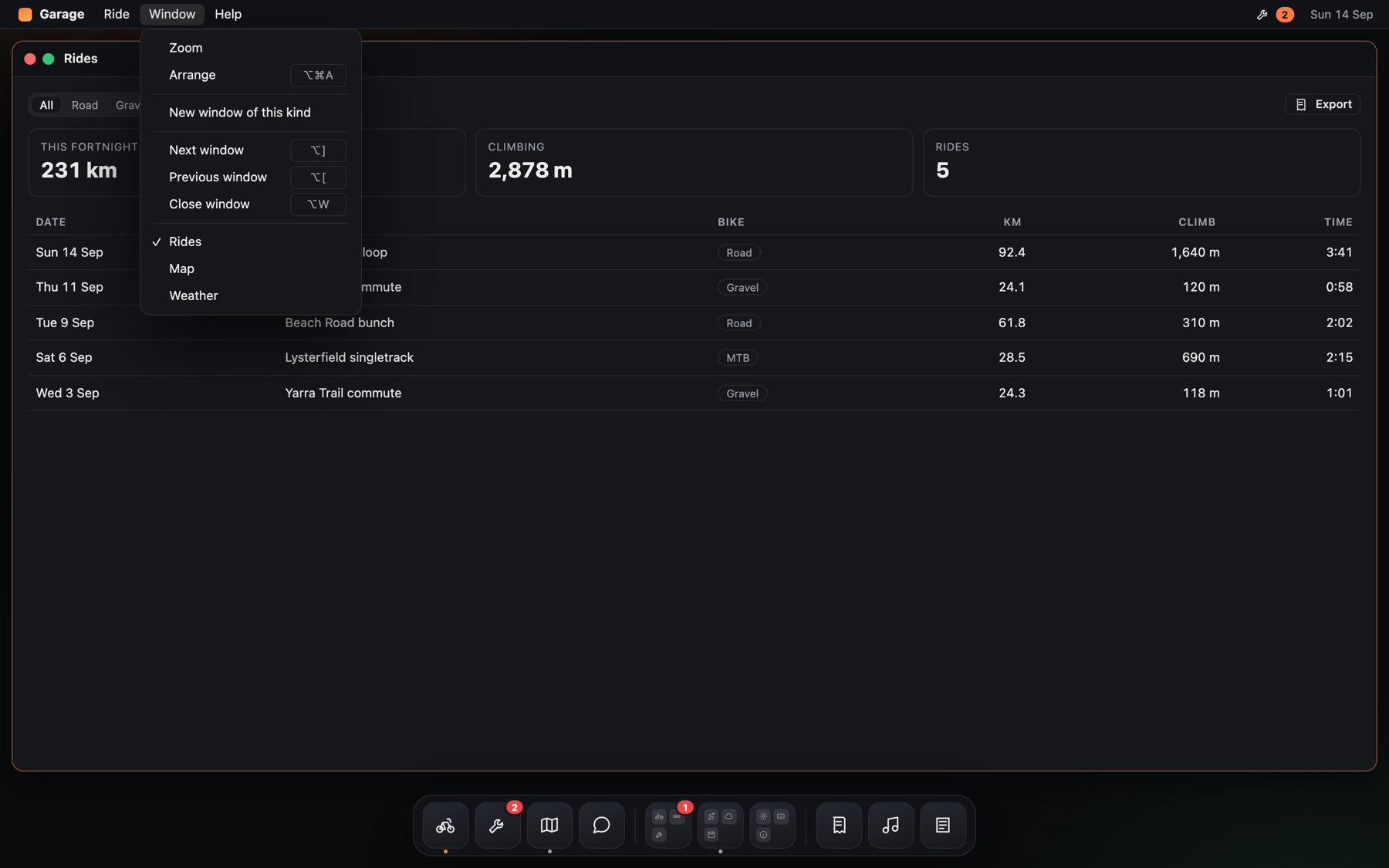
The dock along the bottom, with a badge and a stack; the Window menu listing what is open.
import { Dock, dockItem, dockSeparator, dockStack } from '@liberation-data/desk/react'

<Dock
  entries={[
    dockItem({ id: 'rides', label: 'Rides', icon: <RideIcon /> }),
    dockItem({ id: 'service', label: 'Service', icon: <WrenchIcon />, badge: 2 }),
    dockSeparator('stacks'),
    dockStack({ id: 'plan', label: 'Plan', items: [routes, weather, calendar] }),
  ]}
/>
An item opens the window with its id (or window), and shows a dot while that window is open. A stack fans
its items out above the dock and previews the first four icons. onSelect replaces opening a window.
The dock is one tab stop: arrow keys move along it, Enter opens, Escape folds a stack away and returns focus
to it. With placement="overlay" (the default) it floats over the bottom of its positioned parent; set
--desk-inset-bottom so windows stop above it.
<Dock
  entries={[
    ...fixed,
    dockSeparator('kept'),
    ...kept.map(app =>
      dockItem({
        id: `app#${app.id}`,
        label: app.name,
        icon: <AppIcon app={app} />,
        movable: true,
        contextMenu: () => [menuAction('Open', () => desk.open(`app#${app.id}`)), menuAction('Remove from Dock', () => unpin(app.id))],
      }),
    ),
  ]}
  pins={{ accepts: 'app', onPin: (drag, before) => pin(drag.payload, before), onMove: (id, before) => move(id, before) }}
/>
The dock does not store what is kept; the app does, beside its other preferences, and passes it back as
entries. Drop something the dock accepts on it to keep it: on the dock it goes at the end, on a movable
item it goes in front of that one, and the fixed items are never split. A movable item can be carried along
the dock to a new place. contextMenu gives any item a right-click menu; an item that is disabled but has
a menu stays reachable, so something that can no longer open can still be removed.
import { Button, InfoTip, Pane, Toolbar } from '@liberation-data/desk/react'

<Pane
  label="Log"
  header={
    <Toolbar
      label="Log controls"
      trailing={<><Button onClick={pause}>Pause</Button><Button onClick={load}>Refresh</Button></>}
    >
      <TextField className="desk-grow" label="Filter" value={filter} onChange={…} />
      <InfoTip label="About these logs">This process only, and nothing that survives a restart.</InfoTip>
    </Toolbar>
  }
  footer={<p>{lines.length} lines</p>}
>
  {lines.map(line => <LogLine key={line.id} line={line} />)}
</Pane>
A window is a fixed height, so something inside it has to give. A pane fills the window and scrolls only
its middle: the toolbar and the footer stay where the pointer left them, and the window itself never
scrolls. Name the pane and the scrolling part can be reached and scrolled from the keyboard. bodyRef and onScroll
hand over the scrolling element itself, for a view that follows its own tail.
Toolbar is one aligned row — every control on the same centre line whatever its own height, trailing
pushed to the end, and className="desk-grow" on the one item that should take the spare room.
InfoTip is an (i) holding what the view would explain if asked, so a window does not open with a
paragraph everyone reads once. Explanation only: a warning belongs in front of people, not behind a
disclosure.
import { Button, SegmentedControl, TextField, Toggle } from '@liberation-data/desk/react'

<Button intent="default" onClick={save}>Save ride</Button>
<SegmentedControl label="Filter by bike" options={BIKES} value={bike} onChange={setBike} />
<Toggle checked={metric} onChange={setMetric} label="Kilometres and metres" description="Off shows miles" />
<TextField label="Wheel size" value={wheel} onChange={e => setWheel(e.target.value)} error={wheelError} />
Each control carries its own behaviour and accessibility; the look comes only from tokens, and there are few
style props on purpose. intent="default" marks the one action a view leads with. A segmented control is one
tab stop whose arrow keys move the selection past disabled options. A toggle is a switch for settings that
apply at once — a checkbox is for one that waits for Save. A text field always has a label (labelHidden
keeps it for screen readers), and an error marks it invalid and replaces the help text. A choice group
is the handful of cards a setup step turns on — an icon, a label, a line of why — with native radios
underneath, so it is one tab stop and the arrow keys move the choice.
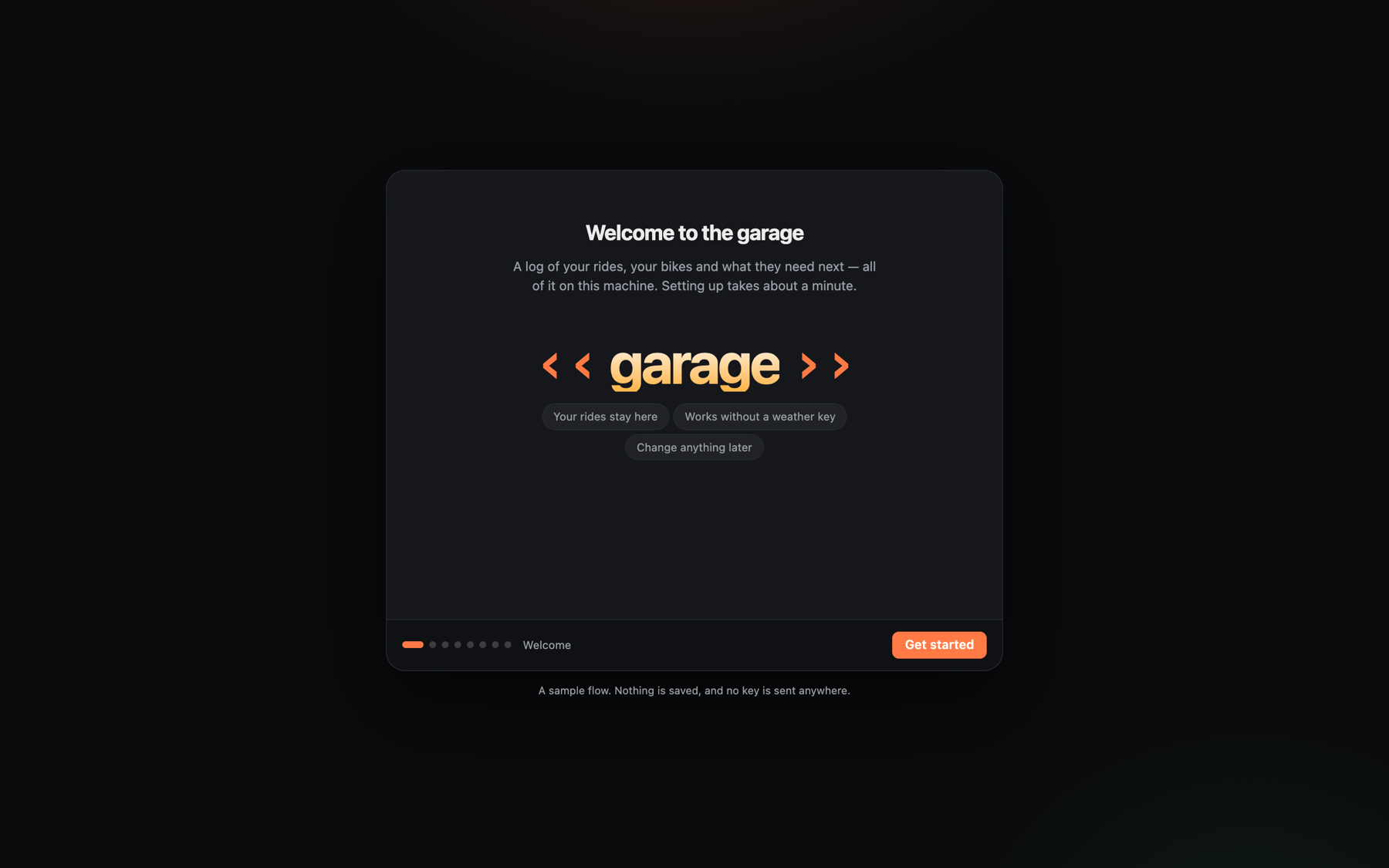
First run: one question at a time, with the steps named along the bottom.
const steps: WizardStep[] = [
  { id: 'welcome', name: 'Welcome', title: 'Welcome to the garage', continueLabel: 'Get started' },
  { id: 'rider', name: 'Rider', title: 'Who is riding?', complete: name.length > 1, body: <TextField … /> },
  { id: 'weather', name: 'Weather', title: 'Connect a weather service', complete: key.length > 0,
    continueLabel: 'Connect', busyLabel: 'Checking the key…', onContinue: checkKey,
    skip: { label: 'Set up later', onSkip: skipWeather } },
  { id: 'finishing', name: 'Finishing', title: 'Setting up', working: true, complete: done, onEnter: install },
]

<Wizard steps={steps} index={index} onIndexChange={setIndex} onFinish={start} />
One pane, one question at a time, Back and Continue where the eye already is. complete gates Continue, so
a step cannot be passed until it is answered; skip is the quiet way past a step that can wait; working
is a step with nothing to do but wait, which offers no Back. onContinue is the work Continue does before
moving on — create the account, check the key: while it runs Continue shows busyLabel and nothing can be
pressed twice; throw to stay on the step with the message shown in it, or return false to stay quietly.
Focus moves to each step's heading as it arrives, so it is announced — and only when the step changes, so a
field in the pane keeps what is typed.
const setup = useTasks([
  { id: 'profile', name: 'Save your profile', run: () => saveProfile(profile) },
  { id: 'rides', name: 'Import your rides', run: async report => { for await (const n of importRides()) report(`${n} of 24`) } },
])

{ id: 'finishing', name: 'Finishing', title: 'Setting up', working: !setup.failed, complete: setup.done,
  onEnter: setup.restart, body: <Checklist items={setup.items} onRetry={setup.start} /> }
The jobs a setup does while someone watches run in order. Each says how it is getting on (report), and one
that throws stops the rest and shows why, with Try again picking up from the task that failed rather than
from the top. working: !setup.failed gives the step its Back again once something has gone wrong.
const progress = useSetupProgress({ key: 'garage', initial: { rider: '', bikes: [] }, store: serverStore })
if (!progress.loaded) return null
if (!progress.finished) return <Wizard index={progress.index} onIndexChange={progress.setIndex} onFinish={progress.finish} … />
Setup is remembered: closing the tab on step four resumes on step four, and a finished setup is not shown
again until reset() ("Set up again"). The store is the app's to choose — this browser's local storage by
default, or a SetupStore with load, save and clear that talks to a server. Keep answers to what a
person would mind retyping; never a password or a key.
const TOUR: Tour = {
  id: 'first-look',
  name: 'What needs doing',
  description: 'A minute on where the jobs are and what wore out.',
  steps: [
    { window: 'service', point: 'service-chain', caption: 'Service lists what the bikes need.' },
    { window: 'rides', caption: 'Choose a ride in the table.', yourTurn: true, until: 'ride.selected' },
    { window: 'chat', caption: 'Ask which job to do first.', yourTurn: true },
  ],
}

{touring && <TourBar tour={TOUR} offer={firstRun} onFinish={done} onStop={done} />}
A tour drives the desk: each step opens the window it is about and points at the control it is talking
about (point is a data-tour name or any selector), so the person watches the real app rather than
reading about it. A yourTurn step hands over and waits, offering Done and Skip. Give it until — an event
topic, or a topic and a test — and it moves on by itself when the person has done it, with no Done to press.
offer asks first ("Show me" or "Not now") and opens nothing until the person says yes: use it the first time
someone reaches the desktop, straight after setup, so nobody lands there without a word. The bar holds no
content: the steps are the app's.
// In the list — one source, because a hook cannot be called per row
const rides = useDragSource<Ride>({ type: 'ride' })
<Table rowProps={row => rides.dragProps(row, row.name)} … />

// In the map
const { dropProps, over, ready } = useDropTarget<Ride>({ accepts: 'ride', onDrop: ({ payload }) => draw(payload) })
<div {...dropProps}>{ready && <p>Drop a ride here</p>}</div>
Built on Pointer Events, so touch and pen work the same way, the preview is drawn by us, and Escape calls
the drag off. A drag carries a type and a payload and says which window it came from; a target says which
types it takes and lights up while something acceptable is in the air. Dropping brings the window that took
it forward. useDraggable is the single-item form of the same thing.
A self-contained page — the kind an assistant writes when asked for an app — can run in a window and take part like any other:
<AppFrame
  title="Ride Card"
  srcDoc={withAppBridge(generatedHtml)}
  listens={['ride.selected']}   // what it may hear
  says={['ride.selected']}      // what it may say
  accepts="ride"                // what may be dropped on it
  opens={['map']}               // windows it may ask for
/>
Give it theme and the app wears the desk's look instead of whatever its author hard-coded:
<AppFrame
  title="Ride Card"
  srcDoc={withAppBridge(generatedHtml)}
  theme={{ mode: 'dark', tokens: { '--sb-bg-dark': '#0b0f1a', '--sb-accent': '#625fff' } }}
/>
The bridge sets those custom properties on the app's own root, stamps data-theme and
color-scheme with the mode — data-theme being what desk's own stylesheet reads and what the HIG
asks app authors to honour, so a page already written that way follows along with nothing added, and re-sends the lot whenever it changes — a person switching theme
switched the app too, not just the chrome around it. An app that would rather decide for itself can
read desk.theme, watch desk.onTheme(…), or ignore both.
Inside the page, the bridge gives it a small desk object: desk.on(topic, …), desk.onDrop(…),
desk.publish(topic, payload), desk.open(window), desk.theme and desk.onTheme(…). The page runs sandboxed with no access to the host's
origin, and talks only through messages. The host grants each app its topics, drop types and windows;
anything else it sends is dropped, and messages from anywhere but its own frame are ignored.
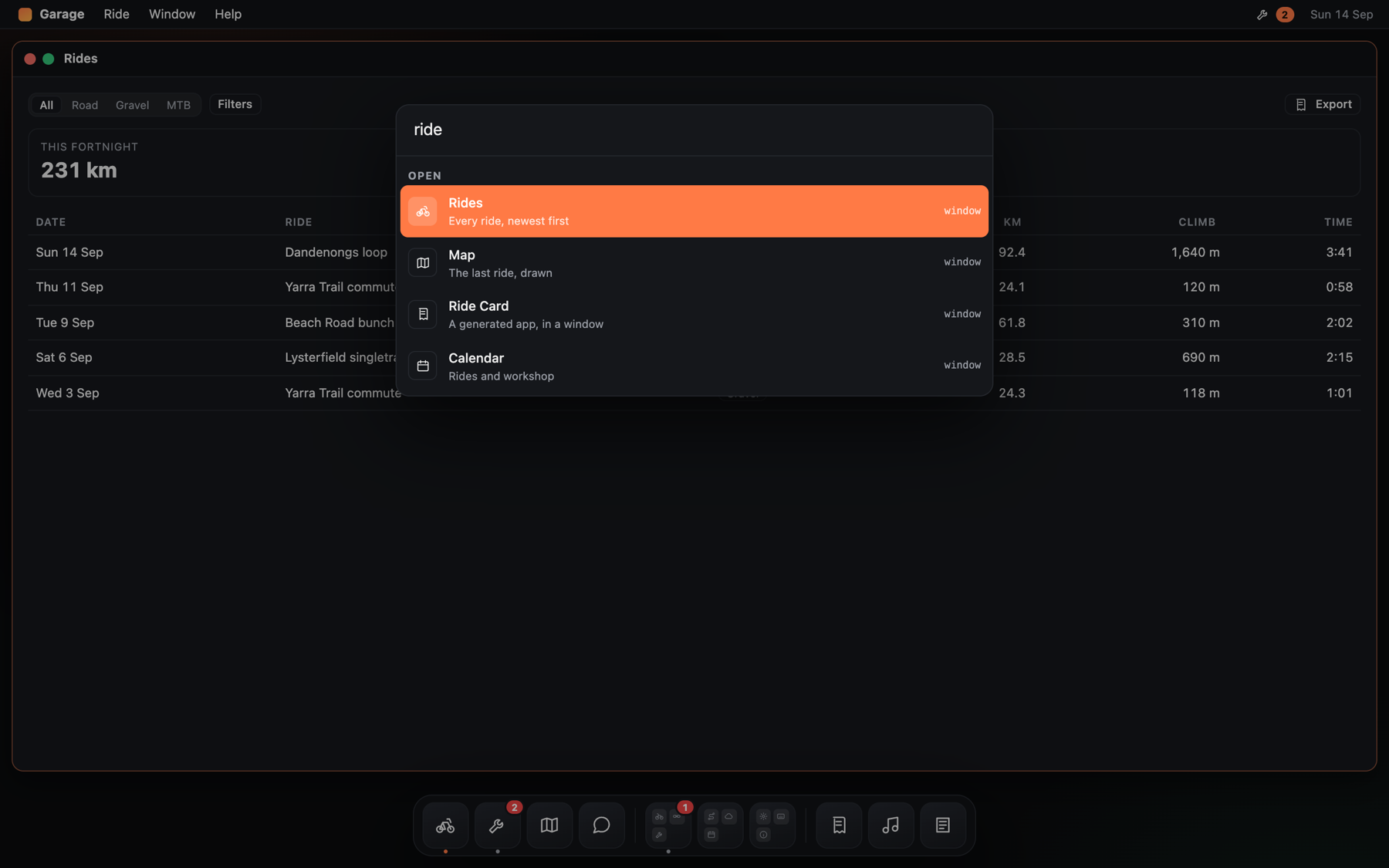
The palette, grouped and keyboard-driven. The app supplies the results.
import { SearchPalette, windowResults } from '@liberation-data/desk/react'

<SearchPalette open={open} onOpenChange={setOpen} search={query => [
  ...windowResults(desk, titleOf),
  ...rides.filter(matching(query)).map(asResult),
]} />
The app says what the results are; the palette does the typing, grouping, keyboard and choosing. It binds
mod+k and answers the desk.search command, so a menu item can open it too (pass shortcut={null} when
the menu binds the key itself). An async search is safe: a slower answer to an older query never overtakes
a newer one.
One bar to type into, which reaches whichever window is key:
// In a window: take the text while this window is in front.
useWindowInput(setFilter, { placeholder: 'Filter rides by name…', target: 'Rides' })

// In the shell: the bar, and what happens when no window takes the text.
<InputBar onSubmit={askTheAssistant} fallbackPlaceholder="Ask anything…" fallbackTarget="Chat" />
The bar is summoned (⌘J by default) and opens over the middle of the screen, the way Spotlight does;
Escape dismisses it, and sending closes it. mode="inline" puts it wherever you like instead. Either way it
asks the responder chain how to present itself, so its placeholder and the goes to line follow the key
window, and a window that registers nothing lets the fallback have the text.
Windows tell each other what happened rather than calling each other:
const publish = usePublish()                 // stamped with the window it came from
publish('ride.selected', ride)

useDeskEvent<Ride>('ride.selected', event => show(event.payload), { replay: true })
Topics are dotted names; a subscriber can take a branch with ride.* or everything with *. A desk
carries its own bus, so this needs no extra provider. replay
delivers the last event on the topic straight away — the window that the event concerns is often opened by
that very event, and would otherwise miss it by a frame.
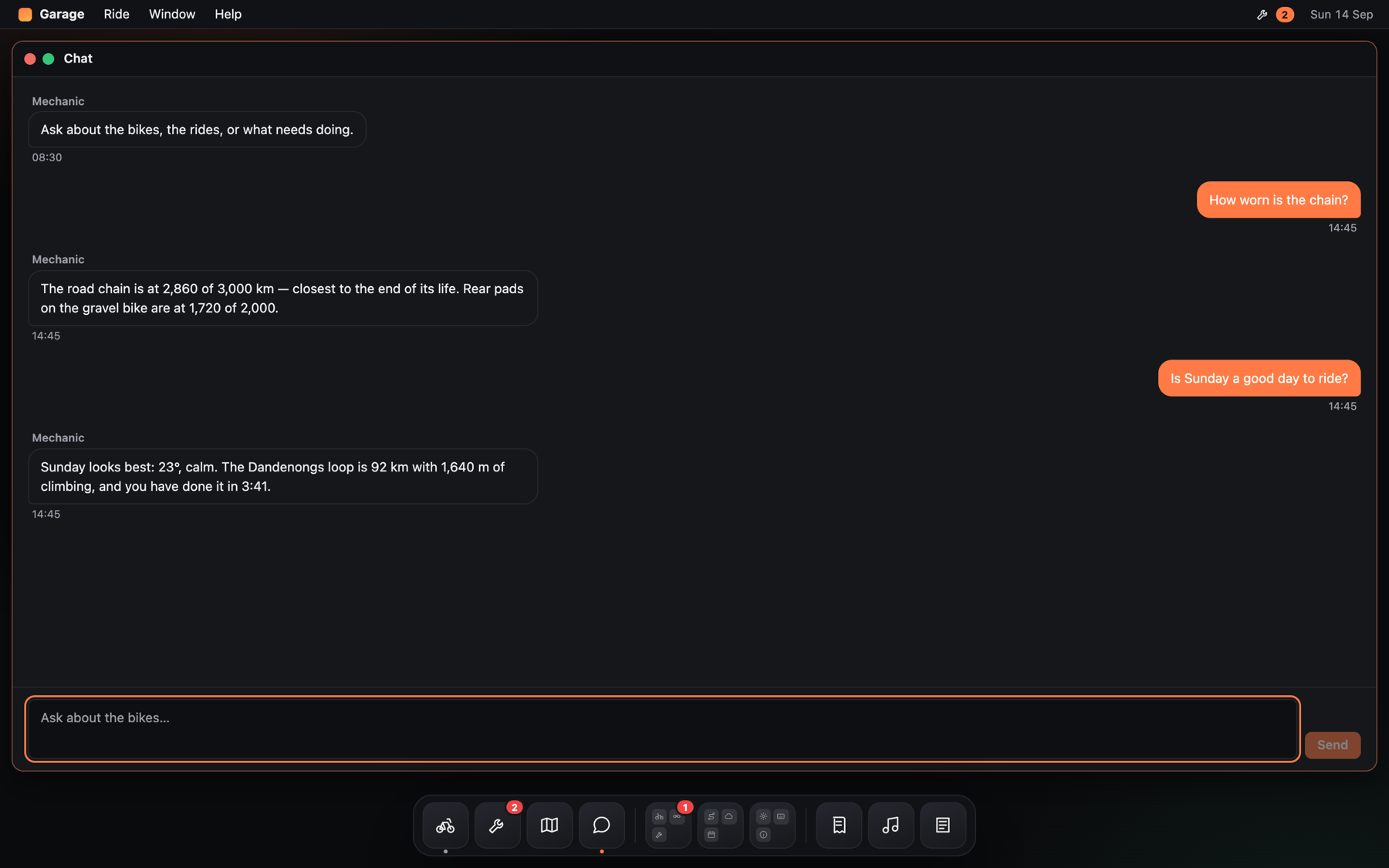
A thread and a composer, with no opinion about who is answering.
import { Composer, Thread } from '@liberation-data/desk/react'

<Thread messages={messages} me="me" typing={thinking} onRetry={resend} />
<Composer value={draft} onChange={setDraft} onSubmit={send} busy={thinking} onStop={cancel} />
Presentational only: no transport, and no opinion about who is answering. The thread groups a run of
messages from one author, marks yours apart, shows sending and failed states with Retry, and follows the
conversation only while you are at the end of it — scroll back and new messages become a 2 new messages
button instead of yanking you away. The composer grows with the text, sends on Enter, keeps Shift+Enter for
a new line, never sends mid-composition in an input method, and turns Send into Stop while an answer is
arriving.
<Table label="Rides" rows={rides} columns={COLUMNS} rowId={r => r.id}
       selected={selected} onSelect={choose} onActivate={open}
       sort={sort} onSortChange={setSort} empty={<p>No rides yet</p>} />

<Sidebar label="Bikes" sections={SECTIONS} value={bike} onChange={setBike} />

<PopUpButton label="Distance" options={UNITS} value={units} onChange={setUnits} />
<Checkbox checked={commutes} onChange={setCommutes} label="Count commutes towards wear" />
<Slider label="Warn at" value={90} onChange={setThreshold} format={v => `${v}% worn`} />
A table renders what it is given — no paging, no fetching — and is one tab stop: arrow keys move the
selection, Enter or a double click opens a row, and a sortable heading says which way it is sorted. A
sidebar is navigation, so where you are is aria-current and stays put. A pop-up button is what a
segmented control becomes when there are too many options to show at once; unlike a menu it takes focus, and
typing jumps to an option. A checkbox is for a setting that waits for Save (a Toggle applies at once),
and can stand for a mixed set. A slider reads its value in words for people who cannot see it.
Least interrupting to most (see HIG.md §7):
import { Alert, Popover, Sheet, ToastProvider, useToast } from '@liberation-data/desk/react'

<Popover open={open} onOpenChange={setOpen} label="More filters"
         trigger={props => <Button {...props}>Filters</Button>}>…</Popover>

<Sheet open={exporting} onDismiss={cancel} title="Export rides" actions={…}>…</Sheet>

<Alert open={confirming} title="Clear these notes?" confirmLabel="Clear notes" destructive
       onConfirm={clear} onCancel={stop} />

const toast = useToast()
toast.show({ message: 'Ride deleted', action: { label: 'Undo', onSelect: restore } })
A popover belongs to one control and closes when you press outside. A sheet belongs to one window and blocks only that window — it renders inside it, so the rest of the desk stays usable. An alert stops the app and is for what cannot be undone; Cancel comes before the action, and a destructive action is never the default button. A toast interrupts nothing, carries Undo, and waits while the pointer or focus is on it. All three overlays trap focus, give it back on close, and answer Escape topmost-first.
import { MenuBar, menuAction, menuCommand, menuSeparator, windowMenuItems } from '@liberation-data/desk/react'

<MenuBar
  leading={<AppMark />}
  menus={[
    { id: 'app', label: 'Garage', items: [menuAction('About Garage', showAbout), menuSeparator(),
                                           menuCommand('Settings…', 'app.settings', { shortcut: 'mod+comma' })] },
    { id: 'window', label: 'Window', items: () => [                // a function: re-read each time it opens
        menuCommand('Arrange', DeskCommands.arrange),
        menuSeparator(),
        ...windowMenuItems(desk.getState(), desk.focus, titleOf),
    ] },
  ]}
  status={[{ id: 'service', label: 'Service, 2 due', title: <WrenchWithBadge />, items: dueItems }]}
  trailing={<Clock />}
/>
A menuCommand is enabled when something in the responder chain can perform it right now, and chooses the
same responder a shortcut would: opening a menu never takes focus from the window you were working in. Menus
own their shortcuts, as in AppKit — a command item's shortcut is shown and bound. Keyboard: Tab reaches
the bar, arrow keys move between menus and items (skipping separators and disabled items), a letter jumps
to an item, Enter chooses, Escape closes.
function RideRow({ ride }) {
  const { target, menu } = useContextMenu({
    label: `Actions for ${ride.name}`,
    items: () => [menuAction('Open', () => open(ride)), menuSeparator(), menuCommand('Export', 'rides.export')],
  })
  return <><button {...target} onClick={() => open(ride)}>{ride.name}</button>{menu}</>
}
A right-click opens the menu where the pointer is; the Menu key or Shift+F10 opens it at the item, with the first item ready. Items are the menu bar's, so a command asks the responder chain whether it is enabled and runs from the item that was right-clicked. It closes on Escape, a click elsewhere, scrolling or resizing, and gives focus back. The HIG's rule stands: nothing lives only in a context menu.
<IconView
  label="Apps"
  items={apps.map(app => ({ id: app.id, label: app.name, subtitle: app.scope, icon: <AppIcon app={app} /> }))}
  onOpen={app => desk.open(`app#${app.id}`)}
  contextMenu={app => [menuAction('Open', () => desk.open(`app#${app.id}`))]}
  drag={{ type: 'app', payload: app => app }}
  empty="No apps yet."
/>
A Finder's icons, in rows that follow the window's width. A click selects and a double-click opens;
openOn="single" opens on one click, for a launcher. Arrows move through the grid (up and down by however
many fit in a row), Home and End go to the ends, typing a name jumps to it, Return opens, and the Menu key
opens the item's context menu. With drag, an icon can be carried to a drop target such as the dock.
Some commands name no target — Copy, Close, Find. They go to whoever is responsible, the way AppKit's responder chain works: the focused element, then its window, then the stage, then the app.
function RideList() {
  const [selection, setSelection] = useState<Ride[]>([])
  // Inside a window this answers when that window is key.
  useCommand('edit.copy', () => copyRides(selection), { enabled: selection.length > 0 })
  …
}

const perform = usePerform()        // perform('edit.copy') → true if something handled it
const canPerform = useCanPerform()  // what a menu asks before drawing the item enabled
useShortcuts(KEYMAP)                // { 'mod+c': 'edit.copy', 'mod+shift+z': 'edit.redo' }
isInstalledApp() says whether the app is running installed rather than in a tab. Only then may it take
shortcuts the browser owns: ⌘W for close window and ⌘` for next window, and never ⌘T or ⌘N at all.
The chain is the DOM: commands travel as events that bubble from the focused element, so there is no second
tree to keep in step. The first responder that implements a command decides — if it is disabled, the
command stops there. mod means ⌘ on Apple devices and Ctrl elsewhere; a shortcut nothing handles leaves
the browser's default alone. The desk answers DeskCommands (close, zoom, arrange, next and previous
window) at the stage, and any window can override them.
createDesk() returns a plain object. Anything can drive it — a router, a tour, a keyboard shortcut, a
test:
const { open, focus, close, float, fill, toggleMode, closeAll, subscribe, getState } = createDesk()State is immutable. windows is the order windows were opened, which is the order Arrange lays them out,
so focusing never reshuffles them. stack is back to front; focusedId(state) is its last entry.
import { syncWithLocation } from '@liberation-data/desk'

const stop = syncWithLocation(desk, () => stageSize(), { isKnown: id => id in SURFACES })
The hash carries which windows are open, which float, and which has focus — #w=notes,clock~&f=clock —
but never positions: a shared link opens the same things, not someone else's layout on a different
screen. Opening or closing a window pushes a history entry, so Back closes it; focus and mode changes
replace the entry. Other hash parameters are left alone.
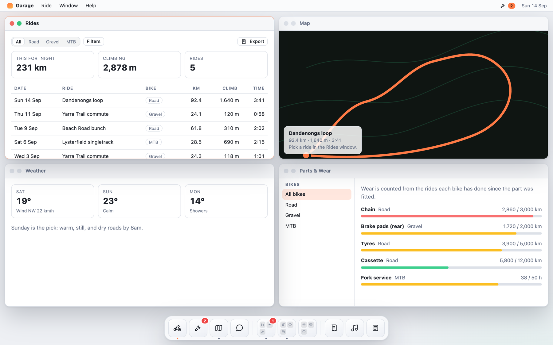
The same desk with data-theme="light" on the root.
Every value in desk.css reads a --desk-* custom property. Redefine the tokens; don't override the
selectors.
desk.css is every part of the stylesheet. An app that draws only some of it can take the parts it
uses instead, and ship less:
import '@liberation-data/desk/css/tokens.css'    // always: every other part reads these
import '@liberation-data/desk/css/windows.css'   // the stage, windows, panes and toolbars
import '@liberation-data/desk/css/dock.css'
import '@liberation-data/desk/css/menus.css'     // menu bar and context menus
import '@liberation-data/desk/css/controls.css'  // buttons, fields, table, sidebar, icon view
import '@liberation-data/desk/css/overlays.css'  // popovers, sheets, alerts, toasts, the (i)
import '@liberation-data/desk/css/conversation.css'
import '@liberation-data/desk/css/search.css'
import '@liberation-data/desk/css/setup.css'     // the wizard and tours
import '@liberation-data/desk/css/apps.css'      // app frames and dragging between windows
``` Light and dark follow `prefers-color-scheme`, and `data-theme="light|dark"` on the root wins.

## Docs

- [docs/guide.md](docs/guide.md) — building an app with it, and what catches people out
- [llms.txt](llms.txt) — the whole public surface in one file, for a coding agent
- [HIG.md](HIG.md) — how an app built with it should look and behave

## Develop

```bash
npm install
npm test            # vitest
npm run typecheck
npm run example     # the Garage sample in examples/garage
npm run size        # the gzipped budget: core 11 KiB, react 46, css 10
npm run check       # everything CI runs
npm run check:browser   # the generated-app bridge in real Chrome, against a running sample
npm run build       # dist/