
Comins Table is a controlled React data table for data-heavy application screens. Applications keep ownership of their data and business models while the Table provides virtualized rendering, structured Rows, configurable Headers, precise selection, and customizable cells.




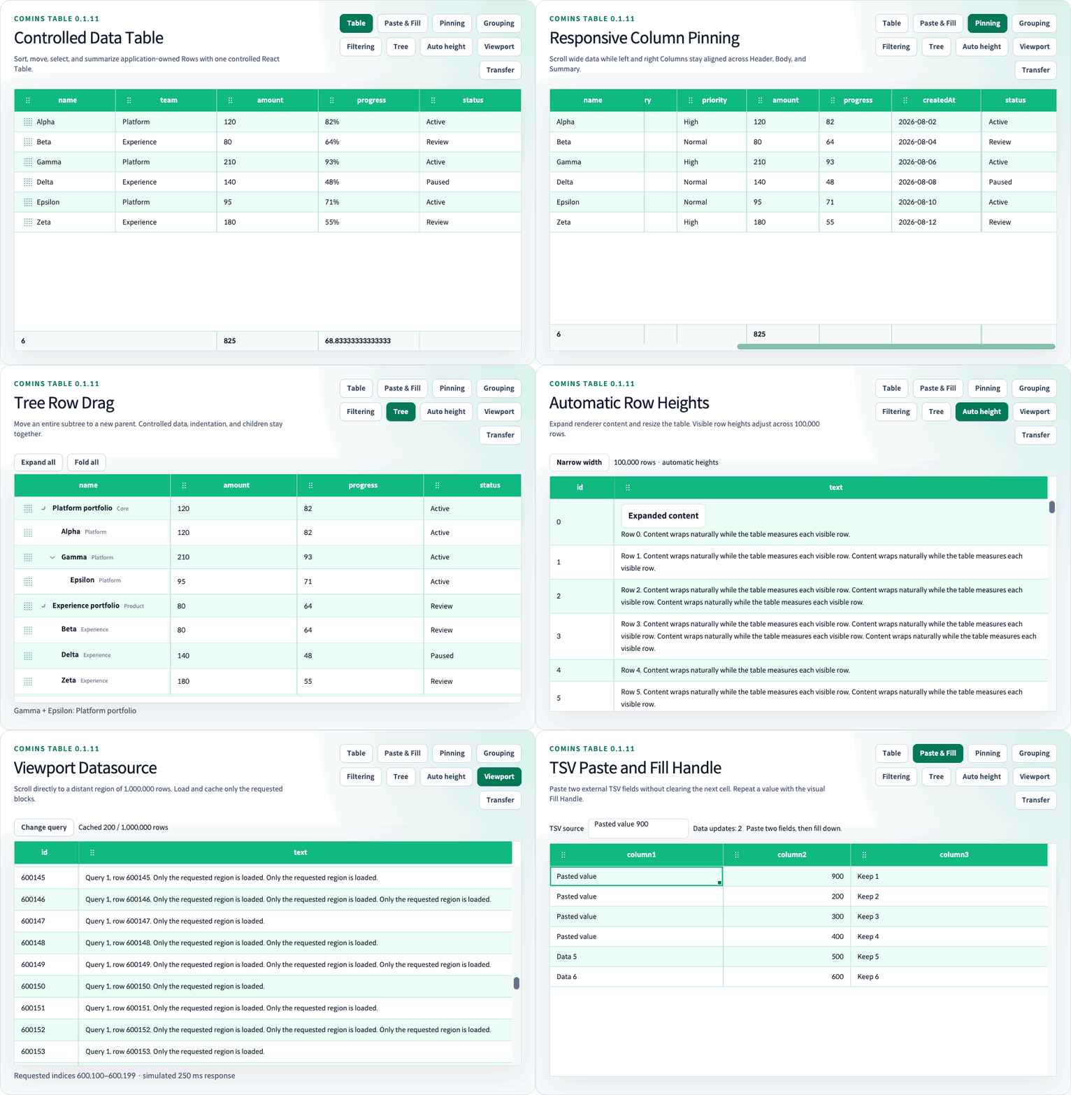
| Area | Shipped capabilities |
|---|---|
| Controlled data | Application-owned data, CRUD helpers, onChangeData, pagination, sorting, and layout callbacks |
| Rendering and scale | Fixed and automatic Row heights, variable-height virtualization, a tested 100,000-row route, bounded Viewport range loading, infinite scroll, append-mode lazy loading, loading, and empty states |
| Interaction | Accessible single and opt-in multi-column Header sorting, controlled Column Filtering, resize, responsive Column Pinning, 6-pixel horizontal column reorder, Cross-Table Row/Group Drag, Row and Cell selection, ranges, clipboard, and context menu callbacks |
| Data structure | Controlled client-side flat Row Grouping, flat Row Expand Details, Summary Row aggregation, and Tree Grid expand/fold and subtree drag |
| Custom UI | Cell/Header renderers, built-in button/input/checkbox/radio/select/toggle/progress/menu/Virtual List components, and CSS-variable themes |
Comins Table is standalone and does not wrap another table or grid implementation.
The source and demonstrations below target 0.1.11. Publication is tracked separately in the changelog.
0.1.11 migration: Row Drag is opt-in with rowProps={{ draggable: true }}. onChangeData is optional for local Row movement; connect it to synchronize application state. New data arrays remain authoritative.
This source version adds opt-in external TSV paste and a visual Fill Handle, with atomic controlled edits and protected Cell guards. Header sorting uses disclosure-family Chevrons, and drag feedback follows the packaged design contract. Tree Row drag, automatic heights, and Viewport Datasource remain available. See the 0.1.11 changelog for the complete change list.
For migration, keep these data-ownership boundaries explicit:
- Local Row reordering needs
rowProps.draggable: true; connectonChangeDatawhen the application must retain the new order. Use stable Row IDs and keep the input array reference stable when relying on internal order. - Tree movement still requires
treeRowDragand controlledonChangeData. Cross-Table transfers use the Coordinator; enabling a local Row handle does not enable transfers. - OS paste and Fill require
cellSelectionandonChangeData; both remain opt-in. A two-field TSV updates two destination Cells. A trailing tab deliberately supplies an additional empty field. - Viewport loading has no Row Drag handles. Reordering a partially loaded dataset belongs to the server, followed by a dataset reset.
This catalog is a consumer-oriented summary, not the complete status registry. Use the Canonical Feature Manifest and the language indexes for every shipped, unsupported, and evidence-linked feature.
| Area | Shipped capabilities | Live examples | Guides |
|---|---|---|---|
| Getting started | Controlled data, CRUD, Core state, loading, and empty states | Getting Started, CRUD |
Quick Start, Data And CRUD |
| Header and layout | Sort, multi-sort, resize, move, Header Groups, Filtering, and Pinning | Header, Filtering, Pinning |
Header, Filtering, Pinning |
| Rows, cells, and selection | Row and Cell callbacks, selection, Clipboard, Context Menu, and Row Expand | Selection, Row Expand |
Row, Cell, Selection |
| Structured rows | Summary Row, Tree Grid, Row Grouping, and Cross-Table Row/Group Drag | Summary, Tree, Grouping, Transfer |
Summary, Tree, Grouping, Transfer |
| Loading and performance | Pagination, fixed/variable-height virtualization, automatic heights, Viewport Datasource, Infinite Scroll, and Lazy Load | Virtualization, Automatic height, Viewport |
Virtualization, Automatic height, Viewport, Lazy Load |
| Rendering and styling | Built-in components, custom renderers, themes, CSS variables, and export helpers | Components, Theme, Export |
Cell, Styling, Export |
| API and utilities | Ref controls, framework-independent Core helpers, Clipboard, and selection helpers | Ref API, Props |
Core State, Clipboard |
| Surface | Support |
|---|---|
| React | >=18.0.0 <20.0.0 |
| React DOM | >=18.0.0 <20.0.0 |
| TypeScript | Declarations bundled with every JavaScript entry point; CSS available through the stylesheet export |
| Chrome and Edge | Current stable Chromium-based releases |
| Automated browser gate | Playwright-bundled Chromium |
| Firefox and Safari | Outside the supported contract until Firefox and WebKit projects are added |
| SSR | Client boundary required; server rendering is not currently supported |
| Runtime network behavior | No package-owned requests, remote assets, telemetry, or error reporting |
The Chrome and Edge row is the compatibility contract. The automated browser gate is evidence from Playwright-bundled Chromium only; it is not a claim that Firefox, Safari, or every installed Edge build was tested.
npm install comins-table react react-domimport { CominsTable, type CominsTableColumn } from "comins-table";
import "comins-table/styles.css";React and React DOM are peer dependencies. Import comins-table/styles.css when the default table shell, themes, and built-in component skin are required.
The Playground is a repository development server, not a command installed into a consumer application.
git clone https://github.com/kim1124/comins-table.git
cd comins-table
npm ci
npm run devOpen http://127.0.0.1:4002/docs/getting-started.
import { useState } from "react";
import { CominsTable, type CominsTableColumn } from "comins-table";
import "comins-table/styles.css";
type UserRow = {
active: boolean;
age: number;
id: string;
name: string;
role: string;
};
const columns: Array<CominsTableColumn<UserRow>> = [
{ field: "name", label: "Name", sort: true },
{ field: "age", label: "Age", sort: true },
{ field: "role", label: "Role" },
{
field: "active",
label: "Active",
cell: {
format: ({ value }) => (value ? "Active" : "Inactive"),
},
},
];
export function UsersTable() {
const [data, setData] = useState<UserRow[]>([
{ active: true, age: 31, id: "u-1", name: "Example user", role: "Admin" },
]);
return (
<CominsTable<UserRow>
columns={columns}
data={data}
getRowId={(row) => row.id}
onChangeData={setData}
pagination={{ pageIndex: 0, pageSize: 30 }}
theme={{ density: "compact" }}
/>
);
}Comins Table is a CSR-focused controlled component for application-owned data. The application owns the Row array or Viewport snapshot passed through data.
For table-owned data mutations, onChangeData emits the next flat Row array or Tree Grid node array; pass that array back through data to retain the mutation. Viewport mode uses a controlled block snapshot instead of a full array; useCominsViewport connects that snapshot and its callbacks. Other controlled models use their matching callback and value prop rather than onChangeData.
Selection, column layout, and sort are internal view state. onChangeSelection, onChangeColumnLayout, onChangeSort, and onChangeSortModel observe those changes so an application can coordinate or persist them externally; the table updates the corresponding view state even when a callback is omitted.
Where restoration is supported, use the supported Ref API: setSelectedRow and setSelectedRows restore Row selection by visible index, setColumnLayout restores layout, and setSortState and clearSort restore or clear sorting. setSortModel restores the complete ordered model; getColumnLayout, getSortState, and getSortModel read the current layout and sort state.
Set multiSort to opt into ordered multi-column sorting. Normal Header click or Enter/Space keeps single sorting; hold Shift while using the same input to add, update, or remove one rule without replacing the others. Active Headers display their 1-based priority.
<CominsTable
  columns={columns}
  data={data}
  multiSort
  onChangeSortModel={(model) => saveSortModel(model)}
/>
getSortModel() and setSortModel(model) read and restore the full model. The existing getSortState(), setSortState(rule), and onChangeSort APIs remain the single-rule compatibility surface. Two-level child Columns and Tree Grid sibling sets use the same ordered comparison rules.
| Import | Purpose |
|---|---|
comins-table |
React component, public types, and root helper exports |
comins-table/core |
State, row, column, pagination, sorting, layout, selection, clipboard, export, and virtualization helpers |
comins-table/clipboard |
Clipboard helper subset |
comins-table/selection |
Selection helper subset |
comins-table/styles.css |
Optional table shell, theme, and built-in component skin |
Sortable headers support pointer and keyboard activation and expose aria-sort. Columns support width constraints and resize interactions.
A left-button mouse interaction activates column movement after a 6-pixel horizontal drag, provided horizontal movement remains greater than vertical movement. The source becomes a source placeholder while a ghost and target marker show the proposed move. Pointer Up commits only over a valid target; vertical intent, pointer cancellation, Escape, and window blur cancel the pending move. Non-mouse pointers retain one-second long-press compatibility. Parent header groups move their children as one block.
Use getColumnLayout() and setColumnLayout() through the Ref API, or serializeCominsColumnLayout() and applyCominsColumnLayout() from comins-table/core, to persist and restore order, widths, and visibility.
Set pinned: "left" or pinned: "right" on a Column or Header Group to keep its atomic block visible during horizontal scrolling and lock its configured position. Direct resize of an effective pinned block stops before it would consume the 48px center budget and demote itself; independent container resize can still temporarily demote inner pinned blocks without changing the persisted layout intent. Header, Body, Skeleton, and Summary use the same offsets. Group Rows and Row Details remain full-width spanning cells; Row Group inner content stays visible at the Body viewport start while horizontally scrolling. See the Column Pinning guide and /examples/column-pinning.
When columns overflow horizontally, Comins Table renders one native horizontal scrollbar at the bottom of the complete Table. A configured Summary Row stays above that scrollbar, while Body trackpad or Shift-wheel input and direct scrollbar input keep Header, Body, and Summary scrollLeft synchronized.
Rows expose click, double-click, keyboard, and context-menu callbacks. Cells expose the corresponding Cell callbacks plus format, renderer, and props hooks.
A normal Row interaction selects one Row, Ctrl/Cmd toggles a Row, and Shift extends the visible Row range from the selection anchor. Cell selection supports a single Cell, visible Ctrl/Cmd discontiguous selection, and Shift or pointer-drag rectangular ranges. CominsSelectionState.cell is the active Cell, cells records the discontiguous set, and range records the rectangle. Built-in component interactions remain isolated from onClickCell and onClickRow callback payloads so component actions do not also trigger the owning Cell or Row action.
Set rowSelectionOnClick={false} to preserve selected Rows while clicking or right-clicking Cells. Application checkboxes or setSelectedRows can control the Row selection independently. getSelectedRows(), getSelectedCells(), and getSelection() read Row data, raw Cell values, and the selection snapshot separately. The default rowSelectionOnClick={true} keeps the existing Row-click behavior.
Row Drag exposes onBeforeRowDrag, onRowDrag, and onAfterDragRow. The before callback can cancel prior to listener registration, target updates emit only on identity or validity changes, and the after callback reports one moved, cancelled, or rejected result per started gesture. Data changes remain controlled through onChangeData or the Cross-Table Coordinator.
See the Row Expand guide and run the /examples/row-expand Playground route.
const [expandedRowIds, setExpandedRowIds] = useState<readonly string[]>([]);

<CominsTable
  columns={columns}
  data={data}
  expandedRowIds={expandedRowIds}
  getRowDetailHeight={() => "auto"}
  getRowId={(row) => row.id}
  onChangeExpandedRowIds={setExpandedRowIds}
  renderRowDetail={({ row }) => <Detail row={row.data} />}
/>;
Row Expand is controlled by stable owner business Row IDs. An interactive disclosure requires the application to feed the next value from onChangeExpandedRowIds back into expandedRowIds; when that callback is omitted, the disclosure is disabled and read-only. A finite positive CSS pixel height is fixed and retains its inline height. Missing values, invalid numeric values, and "auto" use measured automatic height with no inline height. Before an automatic Detail has a matching-width measurement, a valid finite positive estimatedRowDetailHeight is used; otherwise the resolved rowHeight is the estimate. Details render as semantic owner-following Rows, stay outside selection and clipboard addressing, and preserve dormant IDs across sorting and pagination.
Owner data Rows can use getRowHeight independently of Detail height. Tree Grid Row Details and nested Details managed by Comins Table remain unsupported.
See the Row Grouping guide and run the /examples/row-grouping Playground route.
rowGrouping.groups is an application-owned single-depth Group model whose array order remains the actual display order, including empty Groups. Stable Group IDs control expansion, Group Drag reorders the groups model, and existing Row Drag can reorder within a Group or use setRowGroupId to move across Groups. Applications own Group CRUD and write onChangeGroups, onChangeData, and expansion callbacks back to their controlled state. Pure moveCominsRowGroup and moveCominsRowToGroup helpers provide the corresponding JavaScript model transitions.
Each synthetic Group Row is one full-width colspan Cell with a distinct neutral-gray background. Use getGroupRowProps for a typed per-Group className or style, and override --comins-table-group-row-background and --comins-table-group-row-color for theme-level styling. The Table owns disclosure and Drag controls while renderGroupContent can replace its inner label, count, aggregate, badge, or business-action content. Header sorting never reorders Groups; the existing Row sort policy runs independently inside every Group. Built-in count, sum, avg, min, and max aggregations remain available.
Synthetic Group Rows never masquerade as TData: ordinary Row/Cell callbacks, selection, Clipboard, Cell renderers, formatters, and Row Detail remain leaf-only. Row Grouping supports fixed or automatic business Row heights, variable-height virtualization, and grouped leaf Row Detail; Group headings keep the fixed rowHeight. It cannot be combined with pagination, infinite/lazy loading, Viewport Datasource, or Tree Grid. Multi-depth grouping remains deferred.
See the Cross-Table Drag guide and run the /examples/cross-table-drag Playground route.
Create a createCominsTableTransferCoordinator() and pass the same Coordinator, scope, and unique tableId through tableTransfer to participating Tables. Existing Row Drag moves one Row between compatible flat or grouped Tables. Group Drag moves the Group plus every member Row; moving the last Row preserves the empty source Group, while moving a Group removes it from the source model.
Duplicate IDs reject by default. A rejected duplicate displays a post-drop, pointer-adjacent Duplicate ID Tooltip and a restrained target Table outline without intercepting pointer events. The target can replace the Tooltip body through rejectionFeedback.renderTooltip, change its duration, disable default feedback, and customize its CSS variables. Coordinator.onTransferRejected receives the structured duplicate conflict for application Toasts or logging.
The target can reject through canTransfer or explicitly return "overwrite" from resolveConflict; Group overwrite replaces the complete target Group bundle and never merges it. The Coordinator emits one immutable source/target result, and the application applies both controlled models atomically. Cross-Table Transfer is unavailable with Tree Grid, Column Filtering, Infinite Scroll, and Lazy Load.
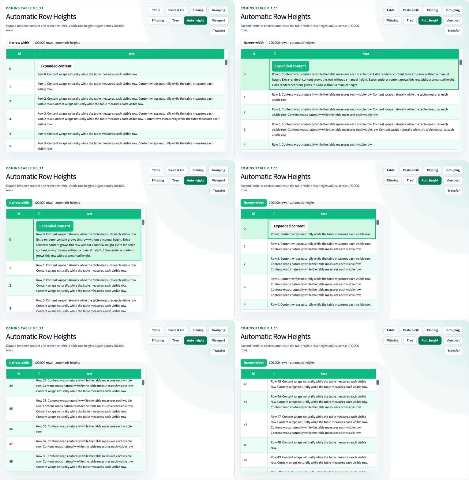
Use getRowHeight={() => "auto"} for content-driven business Row heights, or return a positive number for an individual Row. Omitting the callback keeps the numeric rowHeight default of 36. estimatedRowHeight supplies an initial estimate, not a height limit. Custom Renderers do not need per-Cell height calculations; use normal-flow content and enable wrapping where required. Automatic heights work with Flat, Grouped business, and Tree Rows, including treeRowDrag where that mode supports dragging.
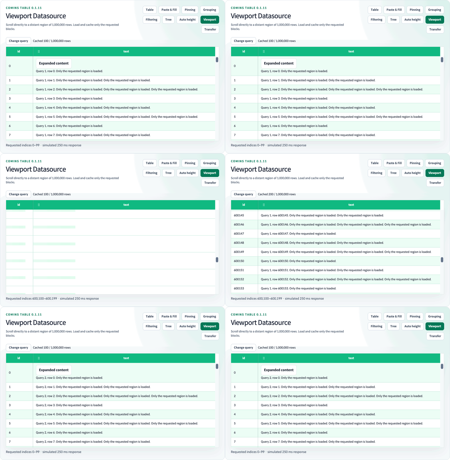
useCominsViewport({ rowCount, queryKey, getRows }) loads blocks around the scroll region and connects them to the Table through tableProps. It enables virtualization and can be combined with getRowHeight={() => "auto"}. The application supplies a known total count, globally stable Row IDs, and arbitrary [startIndex, endIndex) range requests. Change queryKey when server sorting, filtering, or index order changes.
Viewport bounds cached data and measured heights; distant scrolling does not fetch every earlier page or require a full dataset array. Unloaded heights are estimated, so scrollbar size can change as content is measured. Selection getters and copy operate on loaded data without fetching missing Rows. The application owns network requests and edit persistence. Tree, Row Grouping, Row Detail, Row Drag, append loading, pagination, built-in sorting/filtering, and automatic Summary aggregation are unavailable in Viewport mode.
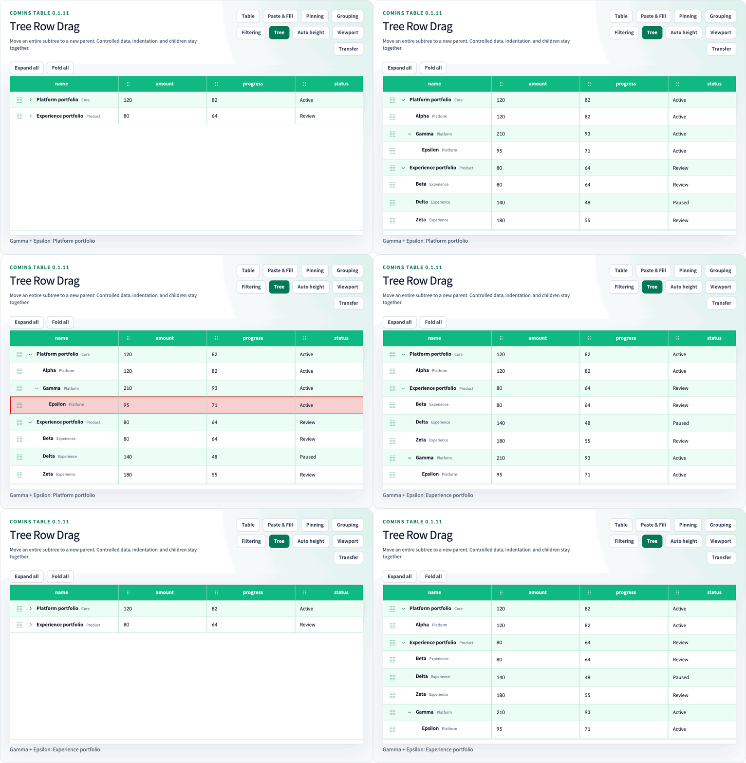
Move Gamma and its child Epsilon to another parent, then fold and expand the hierarchy.
Expand a Cell Renderer and narrow the Table. Row heights adjust automatically across 100,000 virtualized Rows.
Drag the scrollbar to a distant region of 1,000,000 Rows, inspect the bounded cache, and change the query. This recording uses a simulated asynchronous source with a 250 ms delay.
See automatic height, Viewport Datasource, and Tree drag for examples, defaults, and combination limits.
See the Column Filtering guide and run the /examples/column-filtering Playground route.
Each Column opts into text, number, UTC calendar-day date, or boolean filtering through columns[].filter. The application owns the complete columnFiltering.model and the currently open Header Filter popover. Rules across Columns use AND; invalid rules are ignored, text comparison is case-insensitive by default, and between uses an inclusive normalized range.
Filtering runs before Row Grouping membership, sorting, flat pagination, virtualization, and Summary aggregation. Explicit Group positions and empty Groups remain visible while counts and aggregates use filtered leaf Rows. Header sorting does not change the Filter model. Selected Row and expanded Detail IDs remain dormant when hidden, while invalid hidden Cell/range addresses are cleared.
Column Filtering cannot be combined with Tree Grid, Infinite/Lazy Loading, loadingMore, or Row Drag. Group Drag remains available in the supported Row Grouping combination because it changes only the explicit Group model.
Set virtualized, rowHeight, and "buffer-size" for fixed-height windowed rendering; add getRowHeight for numeric per-Row or measured automatic heights. The performance Playground includes a tested 100,000-row route while keeping only the current window and buffer mounted. With ordinary virtualization, the application still supplies the full array. Viewport Datasource additionally bounds loaded data; Infinite Scroll and Lazy Load append to an application-owned array.
infiniteScroll requests application-owned append loading near the body viewport boundary. lazyLoad supports asynchronous append-mode batches with an AbortSignal. When loading is true, an empty table renders skeleton Rows and a populated table keeps its Rows visible under a loading overlay. emptyComponent controls the no-data content.
See the Summary Row guide and run the /examples/summary-row Playground route.
Configure summary.columns with built-in count, sum, avg, min, and max aggregation or a custom aggregator. The object form supports visible-column colSpan, post-aggregation format, and per-cell className and style; summary.className and summary.style apply to the footer Row.
See the Tree Grid guide and run the /examples/tree-grid Playground route.
Set tree and provide controlled { item, expand, children } nodes. defaultExpandAll supplies the initial fallback expansion state and defaults to true; explicit node state wins. expand(nodeIds?) and fold(nodeIds?) update multiple node ids, while an omitted argument targets every branch and an empty array is a no-op. Descendant-only expansion is blocked while an ancestor remains folded unless both ids are included in the same call.
Tree Grid reuses cell.components and cell.renderer, so component cells and custom React renderers work against each node's item. The Tree Grid Playground includes an exactly 10,000-node virtual example.
Set treeRowDrag={{}} and connect onChangeData to reorder siblings at every depth. treeRowDrag={{ allowReparent: true }} also moves entire subtrees between parents or back to the root. Parent changes default to disabled. canDrop and Row guards restrict destinations and sources; cycles are rejected and sorting disables manual movement. moveCominsTreeNode exposes the immutable move helper. Handles support pointer dragging and Space, arrow keys, Enter, and Escape. The Playground drag example starts with parent changes and automatic heights enabled; these are example settings.
Cell components include button, input, checkbox, radio, select, toggle, progress, and virtual-list; Header components also support menu. Use cell.renderer or header.renderer when the built-in component types are not sufficient.
Virtual List Item activation follows the normal Row selection modifiers. More selects its owning Row exclusively before expanding the virtualized list. Search is available only while exactly one Row is selected. Keyboard activation keeps the More button focused after expansion. Item and More actions remain isolated from the Row and Cell click callbacks.
Set clipboard to enable OS keyboard copy. It defaults to false, preserving the existing internal copy buffer. With OS copy enabled, the default priority is multiple selected Cells → selected Rows → one selected Cell. Five selected Rows and three selected Cells copy the three Cells while retaining all five selected Rows. Discontiguous Cells produce a TSV rectangle with unselected positions empty; internal paste skips those positions.
Call copySelection("auto" | "cells" | "rows") from a button or context menu to choose the target explicitly. This Ref method writes to the OS clipboard regardless of the clipboard prop, returns Promise<string | null>, and rejects if writing is unavailable or denied. Native text editing keeps its own copy behavior. Ctrl/Cmd+V uses the Table's internal buffer by default; enable clipboardPaste to import external TSV instead. See the Clipboard guide for guards, TSV escaping, and loaded-data limits.
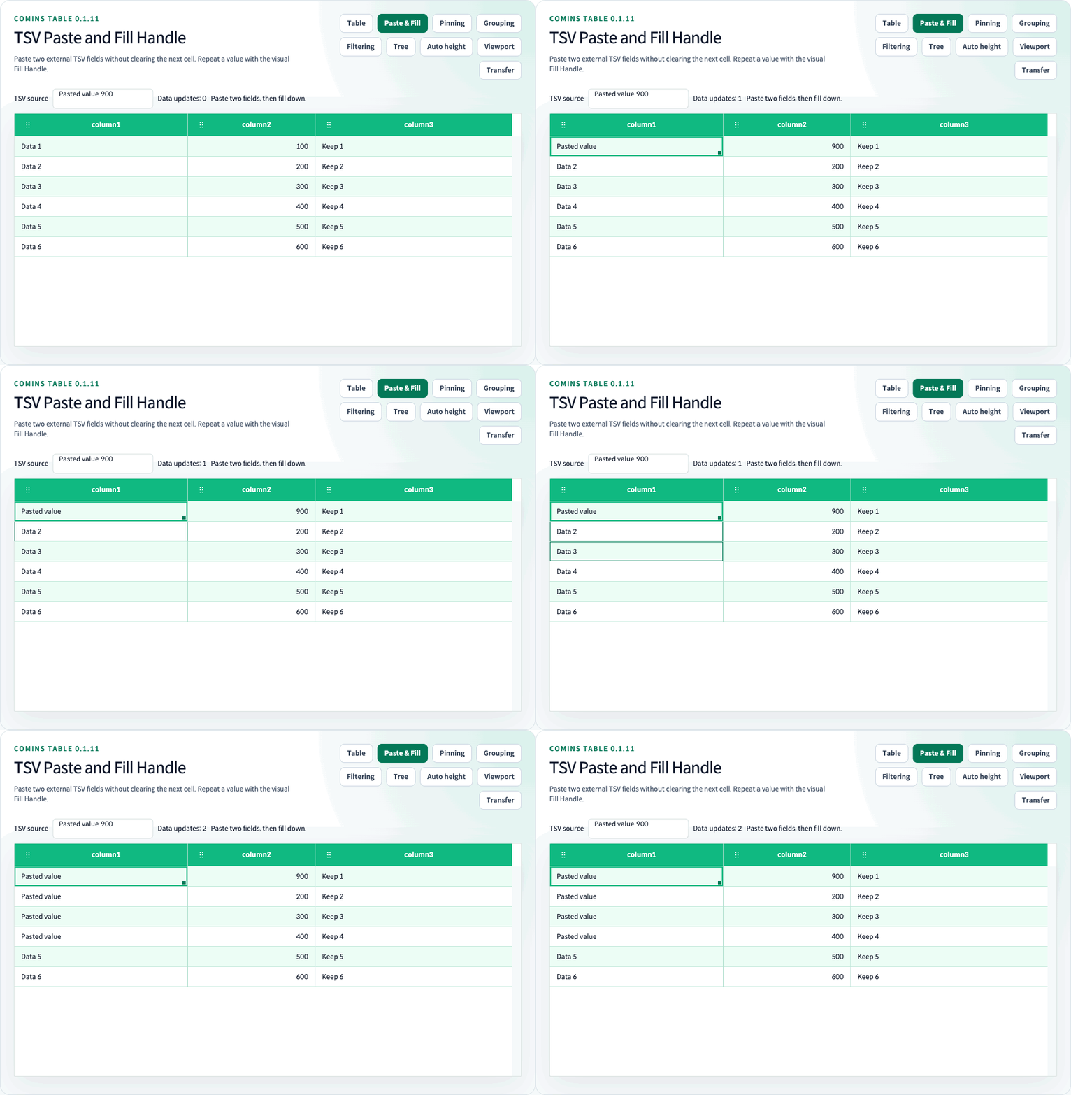
copyCominsRow, copyCominsCell, and copyCominsCellRange read Row or Cell selections. pasteCominsRow, pasteCominsCell, and pasteCominsCellRange apply clipboard data while respecting props.copyable, props.pasteable, and disabled guards. fillCominsCellRange accepts a single Cell or rectangular source pattern. Enable clipboardPaste for OS TSV paste and fillHandle for visual pattern repetition; both default to false and require cellSelection and onChangeData. Set cell.parseClipboard for typed external values, optional cell.validateFill for atomic Fill validation, and onClipboardError for rejected input. parseCominsClipboardText and pasteCominsText are available from the root, /core, and /clipboard. See the Clipboard guide for limits, guards, native-editor behavior, and fillSelection("down" | "right") click alternatives.
Use exportCominsRowsToCsv and exportCominsRowsToJson with the exact rows and export columns the application wants to serialize. Export remains independent of visible pagination, filtering, and selection unless the application passes those rows.
The package stylesheet exposes module-local --comins-table-* CSS variables and does not apply a global reset. The six shipped theme classes are comins-table-theme--basic, comins-table-theme--dark, comins-table-theme--skyblue, comins-table-theme--mint, comins-table-theme--gray, and comins-table-theme--orange.
Use theme.className, theme.style, Row and Group Row class/style hooks, Cell props, and renderer output for application-specific presentation. For uniform fixed-height virtualization, keep rowHeight aligned with --comins-table-row-height when overriding height tokens. Use getRowHeight for variable or automatic business Row heights; CSS height alone does not update the virtual layout.
The Design Contract classifies every Table token as public stable, public experimental, or internal. The Componentization Guide defines when to use a formatter, renderer, built-in component, future typed slot, token, or instance override.
const tableRef = useRef<CominsTableRef<UserRow>>(null);

tableRef.current?.getColumnLayout();
tableRef.current?.setColumnLayout(savedLayout);
tableRef.current?.getSortState();
tableRef.current?.setSortState({ columnId: "age", direction: "desc" });
tableRef.current?.getSortModel();
tableRef.current?.setSortModel([
  { columnId: "team", direction: "asc" },
  { columnId: "age", direction: "desc" },
]);
tableRef.current?.clearSort();
tableRef.current?.setSelectedRow(0);
tableRef.current?.setSelectedRows([0, 1]);
tableRef.current?.getSelectedRows();
tableRef.current?.getSelectedCells();
tableRef.current?.getSelection();
// In a user-initiated handler; handle unavailable or denied clipboard access:
await tableRef.current?.copySelection("rows");
tableRef.current?.setMoveTargetRow(3, 1);
tableRef.current?.expand(["department-1", "team-1-1"]);
tableRef.current?.fold(["team-1-1"]);
tableRef.current?.expand(); // all Tree Grid branches
tableRef.current?.fold(); // all Tree Grid branches
For ordinary array-backed Tables, setSelectedRow, setSelectedRows, and setMoveTargetRow use the visible Row index after current sorting and pagination. Viewport selection setters use absolute dataset indexes and skip unloaded Rows; movement is unavailable. getColumnLayout, setColumnLayout, getSortState, setSortState, getSortModel, setSortModel, and clearSort read and update the current Header view state. expand(nodeIds?) and fold(nodeIds?) accept readonly Tree Grid node-id arrays; flat tables ignore them.
getSelectedRows() returns loaded selected business data in data order. getSelectedCells() returns { rowId, columnId, value } for available selected Cells; ranges use projected display order. getSelection() copies the selection IDs and addresses, including Row IDs retained after Viewport cache eviction. Row objects and Cell values remain application-owned references.
After the repository setup under Installation, the local Playground starts at /docs/getting-started. Key routes include /examples/selection-clipboard, /examples/row-expand, /examples/row-grouping, /examples/column-filtering, /examples/column-pinning, /examples/cross-table-drag, /examples/summary-row, /examples/tree-grid, /examples/component, and /performance/virtualization.
Start with the English Quick Start, documentation index, English feature guides, or Korean feature guides. Use the Design Contract, Componentization Guide, and Canonical Feature Manifest for visual stability, extension ownership, complete feature status, and evidence mapping. Each category links the detailed usage contract, runnable Playground route, related features, and the matching guide in the other language.
Use the source repository for development context, review the changelog for version history, and follow the security policy for vulnerability reporting.
Comins Table provides CSR arrays and known-count Viewport range loading. Server-side Row models and built-in server filtering, custom Filter editor renderers, Tree filtering, pivoting, charts, AI assistance, remote Tree loading, hierarchy pagination, Tree Row copy/paste, Tree Grid Row Details, nested managed Details, Firefox, Safari, and SSR are not shipped or supported.
The visual fill handle repeats values or selected patterns. Automatic numeric/date series and source clearing on range shrink are not supported. Viewport edits require contiguous loaded Rows and never request missing data.
npm run lint
npm run test:run
npm run build
npm run test:e2e
npm run test:perf -- --workers=1
npm run test:consumer
npm run verify
npm run docs:readme-gif
npm run docs:readme-gif is a maintainer command that captures the real hidden Playground fixtures and regenerates the overview animation plus eight detailed feature animations, including TSV paste and Fill Handle, Tree subtree drag, automatic height, and Viewport loading.
The package bootstrap is complete. Trusted publishing for later versions uses the manual publish.yml OIDC trusted publisher and npm stage publish through the protected npm environment. The workflow builds one exact package artifact, verifies and scans that artifact before staging, and requires maintainer approval before public publication. Token-based publication is not part of this release path.