




comins-grid-layout is a React dashboard layout module powered by GridStack. It combines serializable React state with widget CRUD, drag, resize, responsive columns, maximize/minimize flows, persistence, and an advanced escape hatch to the underlying GridStack API.
Current source version: 0.2.3, including copy-drag previews and clearer interactive documentation. Source documentation and recordings describe this version; the npm badge above reports registry availability independently. See the 0.2.3 notes for the versioned changes and migration guidance.
The local example routes below require a source checkout. Follow Run the demo before opening them.
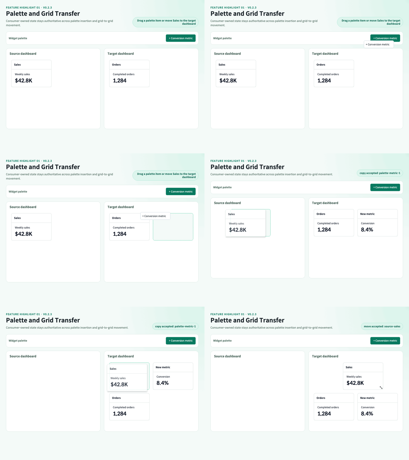
Palette items copy into a target grid, while controlled dashboard widgets can move or copy between grids through typed, fail-closed drop requests.
In grid copy mode, a stationary snapshot stays at the source and a + outline follows the pointer. The animation shows palette insertion and grid movement; select Copy in the Playground to compare the copy preview.
Local example: /examples/advanced/multi-grid/horizontal · Guide
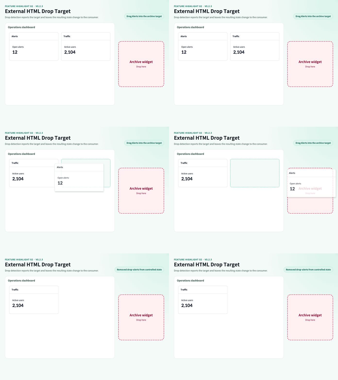
Ordinary HTML can act as a typed drop target. The package reports the release and the consumer decides whether to remove or otherwise update controlled state.
Local example: /examples/advanced/external-drop-trash · Guide
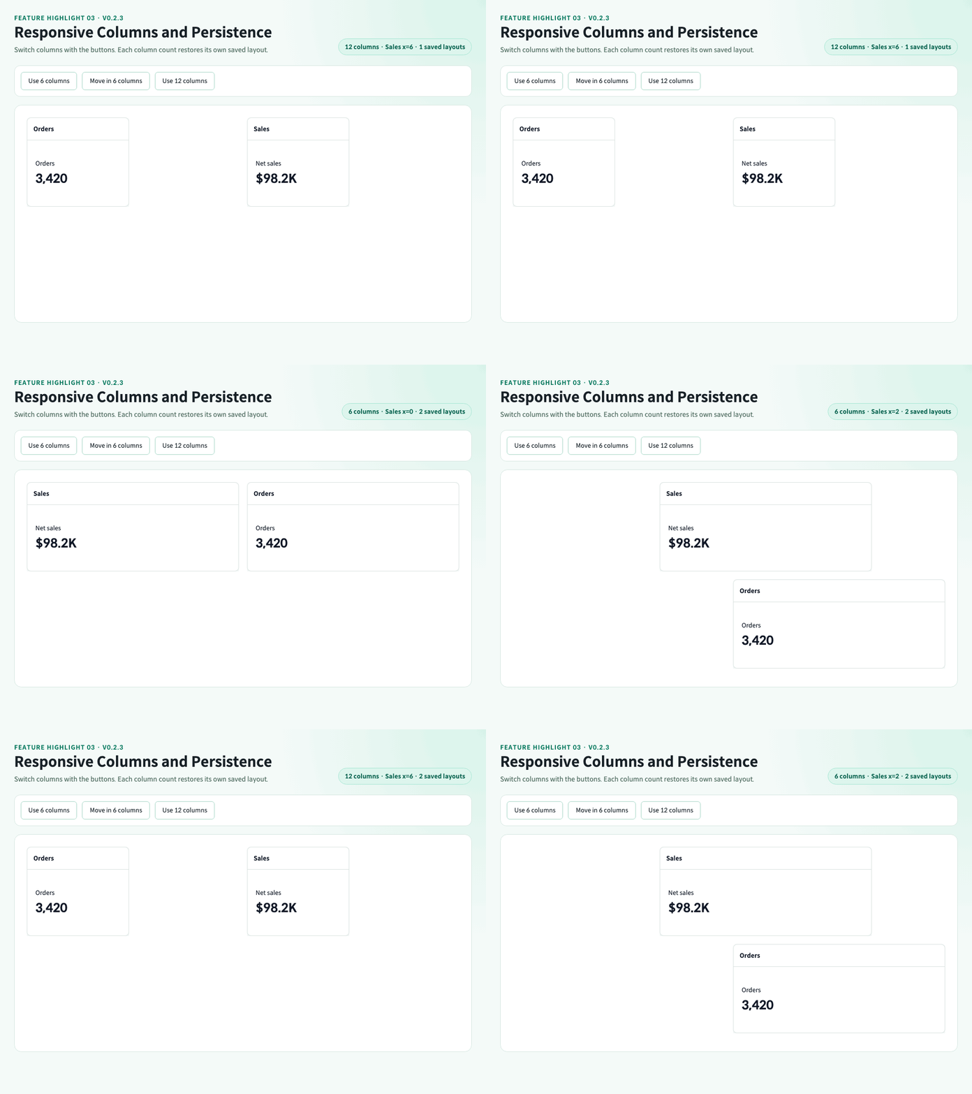
Runtime column changes retain an independent serializable layout for every visited column count and restore it when that column count becomes active again.
The combined Playground separates column calculation (columnWidth or breakpoints) from layout policy (moveScale or none). The animation uses explicit 12/6-column buttons to isolate cache restoration; use the Playground's container-width control to test automatic responsive changes.
Local example: /examples/advanced/responsive · Guide
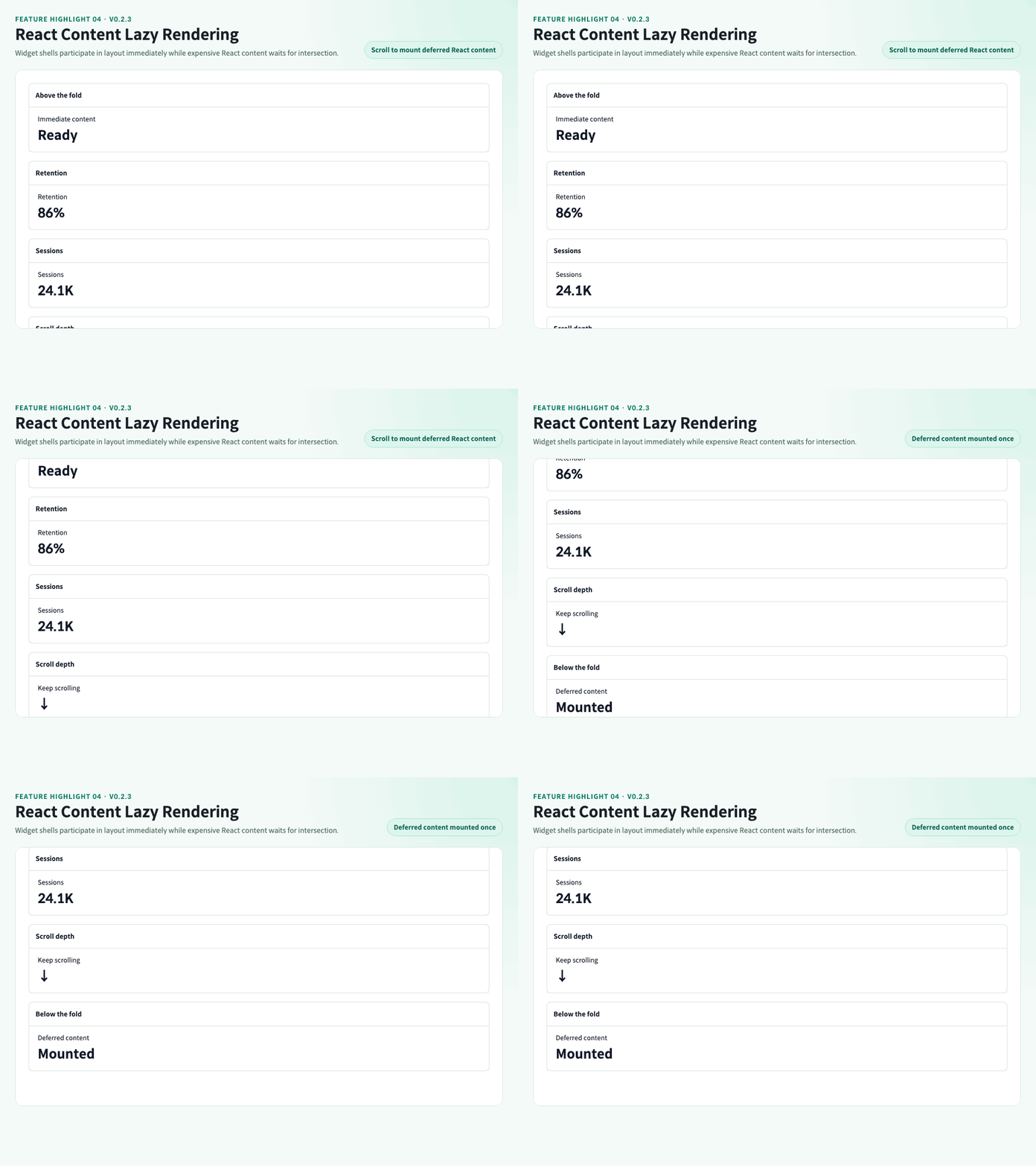
GridStack item geometry remains mounted while expensive React content waits for its first intersection with the configured scroll boundary.
The Playground displays actual mounted-content counts and per-widget Waiting/Rendered status. Scroll inside the example, compare on/off behavior, and restart the experiment to reset it. Already mounted content stays mounted when it leaves view.
Local example: /examples/advanced/lazy-load · Guide
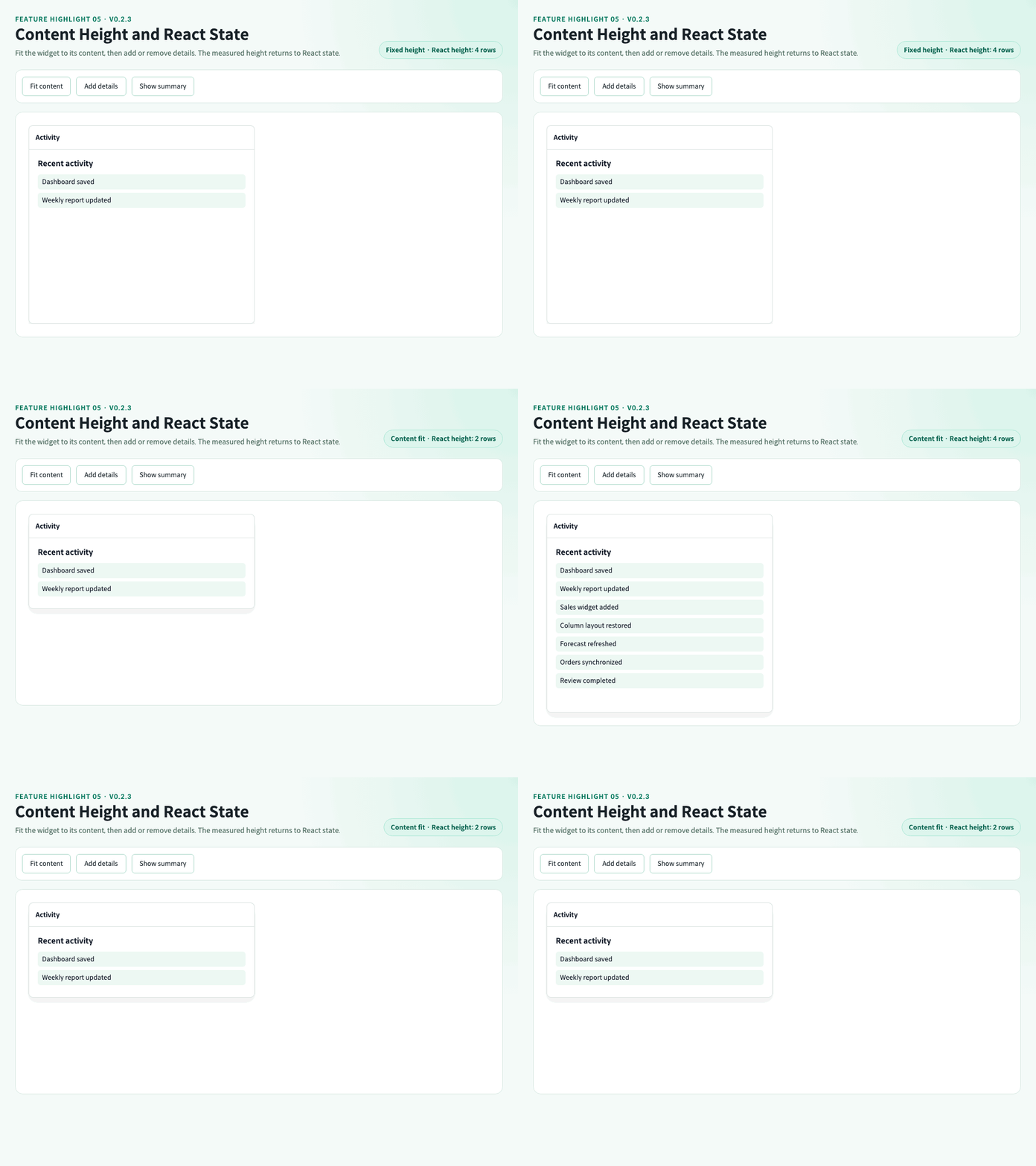
Fit widgets to their content, including the header, and commit the resulting height back to React. Content can grow or shrink while widget identity and mounted content remain stable.
Content sizing is off by default. Enable it for content-driven heights; keep it off for fixed-height cards. It changes row count h, not cellHeight, and turning it off does not restore the earlier height.
Local example: /examples/advanced/size-to-content · Guide
- Create, render, update, remove, clear, maximize, minimize, restore, arrange, and serialize widgets.
- Drag and resize with desktop pointer input and mobile touch input.
- Change the runtime column count from 1 through 12 manually or through responsive GridStack breakpoints.
- Keep application data in serializable React state while GridStack owns browser interaction.
- Schedule resize-frame notifications for charts, tables, canvases, and other responsive widget content.
- Fit widget heights to content with per-widget opt-out and minimum/maximum height constraints.
- Report typed drops on consumer-owned HTML targets without mutating controlled widget state.
- Copy palette widgets into a grid and move or copy widgets between controlled grids with typed, fail-closed drop requests.
- Defer React widget content until it first intersects the configured lazy-scroll boundary while keeping GridStack item geometry mounted.
- Configure the supported GridStack 13 engine surface and access the complete public instance through an optional advanced ref handle.
- Render 100 or more widgets with repeated runtime column changes covered by the resource gate.
| Surface | Supported contract |
|---|---|
| React / React DOM | >=18.0.0 <20.0.0 peer dependencies |
| TypeScript | Declarations and declaration maps included; verified with TypeScript 6 |
| Desktop browsers | Desktop Chrome is automated with Playwright Chromium. Chromium compatibility includes Edge-class engines, but branded Edge is not directly certified |
| Firefox | Representative engine-sensitive scenarios tagged @firefox-parity; not the complete Playwright suite |
| Mobile browsers | Representative touch scenarios tagged @mobile-touch with the Pixel 7 Chromium profile |
| Safari | Not part of the automated browser contract; consumers requiring Safari support must verify it separately |
| SSR frameworks | Import and render inside a client boundary; the package does not use Next.js-only APIs |
| Keyboard | Header action buttons are keyboard-operable; keyboard-based widget move and resize are not provided |
| Nested grids | Explicit controlled DashboardGrid composition is supported; native dynamic GridStack sub-grid ownership is not |
| Runtime network behavior | No package-owned requests, remote assets, telemetry, or error reporting |
Before 1.0.0, only the latest published version receives security fixes.
npm install comins-grid-layout react react-domFrom a source checkout, install the repository dependencies and start the local documentation playground:
npm install
npm run dev
Open http://127.0.0.1:6001/docs/getting-started. The same server exposes every example route referenced below.
Import both stylesheets once in the client bundle:
import "gridstack/dist/gridstack.min.css";
import "comins-grid-layout/styles.css";import { DashboardGrid, useDashboardGrid, type DashboardWidget } from "comins-grid-layout";
import "gridstack/dist/gridstack.min.css";
import "comins-grid-layout/styles.css";
type Metric = { label: string; value: string };
const initialWidgets: DashboardWidget<Metric>[] = [
{
id: "sales",
title: "Sales",
layout: { id: "sales", x: 0, y: 0, w: 3, h: 2 },
data: { label: "Monthly revenue", value: "$128K" },
},
];
export function DashboardPage() {
const dashboard = useDashboardGrid({ initialColumns: 12, initialWidgets });
return (
<DashboardGrid
columns={dashboard.columns}
refreshKey={dashboard.refreshVersion}
widgets={dashboard.widgets}
actionLabels={{ maximize: "Maximize", minimize: "Minimize", restore: "Restore", remove: "Remove" }}
onMaximizeWidget={dashboard.commands.maximizeWidget}
onMinimizeWidget={dashboard.commands.minimizeWidget}
onRemoveWidget={dashboard.commands.removeWidget}
onRestoreWidget={dashboard.commands.restoreWidget}
onLayoutCommit={dashboard.commands.applyLayoutSnapshot}
renderWidget={(widget) => (
<div>
<span>{widget.data?.label}</span>
<strong>{widget.data?.value}</strong>
</div>
)}
/>
);
}widgets is the React source of truth. Connect onLayoutCommit to applyLayoutSnapshot so columns and every committed widget geometry update are applied in one React reducer action. onWidgetLayoutChange remains available for consumers that intentionally persist widgets individually.
type DashboardWidget<TData = unknown> = {
  id: string;
  title?: string;
  layout: {
    id: string;
    x: number;
    y: number;
    w: number;
    h: number;
    minW?: number;
    minH?: number;
    maxW?: number;
    maxH?: number;
  };
  data?: TData;
  minimized?: boolean;
  maximized?: boolean;
  locked?: boolean;
  movable?: boolean;
  resizable?: boolean;
  lazyLoad?: boolean;
  sizeToContent?: boolean | number;
  resizeToContentParent?: string;
};
Widget IDs are preserved across CRUD, movement, resize, serialization, restore, maximize, and minimize flows.
DashboardWidget.lazyLoad is a per-widget override for DashboardGrid.lazyRenderWidget; it does not enable content lazy rendering by itself. With global lazy rendering enabled, lazyLoad: false renders that widget eagerly.
| Prop | Type | Default | Purpose |
|---|---|---|---|
widgets |
DashboardWidget<TData>[] |
required | Controlled widget models and layout geometry |
renderWidget |
(widget) => ReactNode |
required | Consumer-owned widget content renderer |
renderWidgetActions |
(widget) => ReactNode |
— | Replaces the built-in header controls with consumer-owned actions |
columns |
DashboardColumnCount |
12 |
Runtime column count from 1 through 12 |
responsive |
DashboardResponsiveOptions |
— | Lets GridStack select the active 1–12 column count from width or explicit breakpoints |
engineOptions |
DashboardGridEngineOptions |
— | Configures the supported GridStack rendering, rows, handles, direction, and CSP options |
externalDropTargets |
ReadonlyArray<DashboardExternalDropTarget> |
— | Maps target IDs to same-document CSS selectors |
gridId |
string |
— | Identifies a grid that accepts palette or Grid transfer sources |
acceptExternalWidgets |
boolean | (candidate) => boolean |
false |
Enables incoming transfer and optionally filters typed candidates |
gridTransferMode |
"move" | "copy" |
"move" |
Selects the mode advertised when this grid is the transfer source |
editable |
boolean |
true |
Enables both movement and resize when their flags also allow it |
movable |
boolean |
true |
Enables grid-wide movement |
resizable |
boolean |
true |
Enables grid-wide resize |
className |
string |
— | Additional class on the grid section |
refreshKey |
number |
— | Requests an adapter refresh when the value changes |
showControls |
boolean |
true |
Shows widget header actions |
lazyRenderWidget |
boolean |
false |
Renders widget content once it first intersects the grid scroll boundary |
actionLabels |
Partial<DashboardWidgetActionLabels> |
built-in labels | Overrides accessible action labels |
onColumnsChange |
(columns) => void |
— | Receives an actual responsive engine column change once per animation frame |
onLayoutCommit |
(snapshot) => void |
— | Receives a committed layout snapshot |
onWidgetLayoutChange |
(id, layout) => void |
— | Receives each committed widget geometry update |
onWidgetResizeFrame |
(event) => void |
— | Receives animation-frame-scheduled content dimensions during resize |
onWidgetExternalDrop |
(event: DashboardWidgetExternalDropEvent) => void |
— | Reports a final pointer or touch release inside a configured target |
onWidgetDropRequest |
(request: DashboardWidgetDropRequest<TData>) => void |
— | Receives an accepted incoming transfer after GridStack DOM rollback; the consumer applies controlled state |
onBeforeMove / onMove / onAfterMove |
(event) => void |
— | Receives before, animation-frame-coalesced active, and committed move events |
onBeforeResize / onResize / onAfterResize |
(event) => void |
— | Receives before, animation-frame-coalesced active, and committed layout-resize events |
onBeforeTitleDoubleClick / onTitleDoubleClick / onAfterTitleDoubleClick |
(event) => void |
— | Receives the title-only double-click lifecycle in call order |
onMaximizeWidget |
(id) => void |
— | Handles maximize action |
onMinimizeWidget |
(id) => void |
— | Handles minimize action |
onRestoreWidget |
(id) => void |
— | Handles restore action |
onRemoveWidget |
(id) => void |
— | Handles remove action |
renderWidgetActions replaces the built-in action group only while showControls=true. When showControls=false, neither the default actions nor custom actions are rendered.
These aliases remain callable throughout 0.2.x with their existing order and are planned for removal in 0.3.0. New code should use the canonical lifecycle props above.
| Deprecated prop | Replacement | Preserved 0.2.x behavior |
|---|---|---|
onWidgetDragStart |
onBeforeMove |
Called after onBeforeMove |
onWidgetDragStop |
onAfterMove |
Called after layout commit and before onAfterMove |
onWidgetResizeStart |
onBeforeResize |
Called after onBeforeResize |
onWidgetResizeStop |
onAfterResize |
Called after layout commit and before onAfterResize |
onWidgetHeaderDoubleClick |
onTitleDoubleClick |
Title-only legacy alias called before onAfterTitleDoubleClick |
Targets are ordinary consumer-owned HTML, not GridStack widgets or Comins wrappers. The package emits a typed, non-destructive onWidgetExternalDrop callback; it does not remove widget DOM or mutate controlled React state. For a deletion target, the consumer decides to call its existing removeWidget command:
<DashboardGrid
  externalDropTargets={[
    { id: "trash", selector: "#widget-trash" },
  ]}
  onWidgetExternalDrop={({ widgetId, targetId }) => {
    if (targetId === "trash") {
      dashboard.commands.removeWidget(widgetId);
    }
  }}
  {...dashboardProps}
/>

<div id="widget-trash" style={{ width: 300, height: 300 }}>
  Drop here to delete
</div>
Selectors resolve at release time, so a target may mount after grid initialization. When targets overlap, the first configured target wins. Only same-document light DOM targets are supported; cross-frame targets and targets inside a shadow root are outside this contract. onWidgetExternalDrop is the package event surface and no DOM CustomEvent is dispatched. GridStack removable remains outside the controlled Comins engine options.
Outgoing HTML drops and incoming widget transfer solve different state problems:
| Direction | Public surface | State responsibility |
|---|---|---|
| Grid widget → ordinary HTML | externalDropTargets, onWidgetExternalDrop |
The callback reports the release; the consumer decides whether to mutate state |
| Palette/Grid source → controlled grid | useDashboardDragIn, gridId, acceptExternalWidgets, gridTransferMode, onWidgetDropRequest |
The adapter rolls temporary GridStack DOM back first; the consumer applies the returned request to controlled state |
Palette candidates always use copy. A grid source uses move by default or copy when its gridTransferMode is set. Duplicate IDs, a rejecting predicate, and locked, non-movable, minimized, or maximized grid sources fail without changing either controlled state.
For gridTransferMode="copy", the stationary source preview is a non-interactive visual snapshot from drag start, not another mounted React widget or registered engine node. It is removed on drop or cancellation. Dropping within the same grid still moves the widget; copying applies to another grid. Both modes preserve the widget ID, so copying again into a target that already contains it is rejected rather than generating a new ID.
import {
  DashboardGrid,
  insertDashboardWidgetAtLayout,
  serializeDashboardState,
  transferDashboardWidget,
  useDashboardDragIn,
  useDashboardGrid,
  type DashboardWidget,
  type DashboardWidgetDropRequest,
} from "comins-grid-layout";

type Data = { kind: "metric" | "restricted" };

const sourceWidget: DashboardWidget<Data> = {
  id: "source-metric",
  title: "Metric",
  layout: { id: "source-metric", x: 0, y: 0, w: 2, h: 2 },
  data: { kind: "metric" },
};

export function TransferDashboard() {
  const source = useDashboardGrid<Data>({ initialColumns: 6, initialWidgets: [sourceWidget] });
  const target = useDashboardGrid<Data>({ initialColumns: 12 });
  const paletteRef = useDashboardDragIn<Data>({
    sourceId: "metric-palette",
    previewLayout: { w: 2, h: 2 },
    createWidget: () => {
      const id = crypto.randomUUID();
      return {
        id,
        title: "New metric",
        layout: { id, x: 0, y: 0, w: 2, h: 2 },
        data: { kind: "metric" },
      };
    },
  });

  const applyDrop = (request: DashboardWidgetDropRequest<Data>) => {
    if (request.source.kind === "palette") {
      const inserted = insertDashboardWidgetAtLayout(
        target.state,
        request.widget,
        request.targetLayout,
        request.targetSnapshot,
      );
      if (inserted.accepted) {
        target.commands.restoreLayout(serializeDashboardState(inserted.state));
      }
      return;
    }

    const transferred = transferDashboardWidget({
      source: source.state,
      target: target.state,
      widgetId: request.source.widgetId,
      targetLayout: request.targetLayout,
      targetSnapshot: request.targetSnapshot,
      mode: request.mode,
    });
    if (transferred.accepted) {
      source.commands.restoreLayout(serializeDashboardState(transferred.source));
      target.commands.restoreLayout(serializeDashboardState(transferred.target));
    }
  };

  return (
    <>
      <button ref={paletteRef} type="button">Drag metric</button>
      <DashboardGrid
        gridId="source-grid"
        gridTransferMode="move"
        columns={source.columns}
        widgets={source.widgets}
        onLayoutCommit={source.commands.applyLayoutSnapshot}
        renderWidget={(widget) => widget.title}
      />
      <DashboardGrid
        gridId="target-grid"
        acceptExternalWidgets={(candidate) => candidate.widget.data?.kind !== "restricted"}
        columns={target.columns}
        widgets={target.widgets}
        onLayoutCommit={target.commands.applyLayoutSnapshot}
        onWidgetDropRequest={applyDrop}
        renderWidget={(widget) => widget.title}
      />
    </>
  );
}
Setting acceptExternalWidgets without handling onWidgetDropRequest is intentionally fail-closed: the adapter removes the temporary target node and no controlled state changes. For keyboard and other non-drag alternatives, call insertDashboardWidgetAtLayout or transferDashboardWidget from a button using the same state transition shown above. The complete move/copy, rejection, and button alternative is available at /examples/advanced/multi-grid/horizontal; /examples/transfer remains a 0.2.x compatibility redirect.
engineOptions supports the following controlled subset. Unsupported GridStack construction, native nested-grid ownership, removable behavior, callbacks, and lifecycle options stay outside the Comins surface.
| Update behavior | Options | Contract |
|---|---|---|
| Runtime synchronization | cellHeight, margin, float, animate, staticGrid, minRow, maxRow, dragHandle, resizeHandles, alwaysShowResizeHandle |
Synchronized through the package adapter |
| Safe reinitialization | rtl, sizeToContent |
Recreates the package-owned adapter while preserving controlled state |
| Initialization-only | nonce |
Remount the grid to change it; never persist it with layout state |
Deprecated in 0.2.1 |
lazyLoad |
Native GridStack content lazy loading does not defer React-owned content; use lazyRenderWidget |
Widgets can additionally map sizeToContent and resizeToContentParent to GridStack. Content sizing includes the header and respects minH/maxH; a widget's sizeToContent: false opts out of global sizing. Maximize/minimize temporarily suspends sizing until restore. After asynchronous content changes, change refreshKey or call refresh() to request measurement and commit the resulting geometry.
editable={false} locks movement and resizing. engineOptions.staticGrid=true also blocks incoming external widget drops. Neither is application-wide read-only mode: consumer-owned inputs, action buttons, and imperative state commands remain independent. Compare both modes at /examples/layout/lock.
For React content deferral, the widget's lazyLoad member acts as a per-widget Comins override when lazyRenderWidget=true; forwarding it to GridStack does not defer React-owned content.
<DashboardGrid
  columns={dashboard.columns}
  widgets={dashboard.widgets}
  engineOptions={{ cellHeight: 88, margin: 8, dragHandle: ".comins-grid-layout-widget__title" }}
  responsive={{
    columnMax: 12,
    breakpointForWindow: true,
    breakpoints: [
      { maxWidth: 720, columns: 1, layout: "list" },
      { maxWidth: 1200, columns: 6, layout: "moveScale" },
    ],
  }}
  onColumnsChange={dashboard.commands.setColumns}
  onLayoutCommit={dashboard.commands.applyLayoutSnapshot}
  renderWidget={renderWidget}
/>
Without responsive, columns is authoritative. With responsive, columns is the initial/fallback count and GridStack owns the active count. Runtime-capable engine options are synchronized in place; rtl and sizeToContent changes safely reinitialize the package-owned adapter while preserving controlled React state. nonce is initialization-only: remount the grid to change it, and never persist it in layout state. Invalid public configuration throws DashboardGridConfigurationError without including the rejected value.
Breakpoints use the grid container width by default; the example explicitly opts into window width with breakpointForWindow: true. The none strategy skips proportional transforms but still corrects column bounds and overlaps. float: true preserves vertical gaps; false compacts widgets upward. Mobile handle visibility accepts "mobile" for coarse pointers and explicit false to disable persistent visibility.
columnWidth calculates a column count from a reference cell width; breakpoints assign counts to width ranges and take precedence when both are configured. Layout policy is a separate choice: none does not turn responsiveness off and does not preserve pixel dimensions. Previously visited counts restore their cached layout. In the combined Playground, changing calculation method or policy (or restarting) resets that cache; width-only changes preserve it.
| Surface | Effect |
|---|---|
lazyRenderWidget |
Enables the Comins React content boundary for the grid |
DashboardWidget.lazyLoad |
Per-widget override; false opts out, while true does not enable global lazy rendering by itself |
DashboardGridEngineOptions.lazyLoad |
Deprecated native GridStack option retained for 0.2.x compatibility; it does not delay React-owned widget content |
The observer uses the nearest [data-dashboard-lazy-scroll] ancestor as its root, or the viewport when none exists. Widget shells and GridStack items remain mounted, content mounts once on first intersection and is retained afterward, and browsers without IntersectionObserver render content eagerly. This is content mount deferral, not full widget virtualization; no skeleton/loading-state API is currently provided.
Normal React state and prop updates still rerender mounted content. Re-enabling lazy rendering does not hide content that has already mounted. The Playground's waiting hints, counters, and restart action are example UI, not package loading-state or data-fetching APIs.
Pass onLayoutMutation to useDashboardGrid to observe successful controlled mutations. Events include a semantic kind, affected widgetIds, active columns, and the resulting full serializable snapshot. Widget-internal events such as title double-click and content resize frames are intentionally excluded.
| Command | Signature | Purpose |
|---|---|---|
addWidget |
(widget) => void |
Add a widget while preserving its ID |
insertWidgetAt |
(widget, targetLayout, targetSnapshot) => void |
Apply an already validated single-grid insertion to reducer state; use the pure helper when rejection details are required |
updateWidget |
(id, patch) => void |
Update widget data, title, state, or interaction flags |
updateWidgetLayout |
(id, patch) => void |
Update serializable geometry |
removeWidget |
(id) => void |
Remove one widget |
clearWidgets |
() => void |
Remove every widget |
maximizeWidget |
(id) => void |
Expand a widget and retain its previous layout |
minimizeWidget |
(id) => void |
Collapse a widget and retain its previous layout |
restoreWidget |
(id) => void |
Restore the retained layout |
autoArrangeWidgets |
() => void |
Compact widgets with the package layout rule |
fitWidgetsToColumns |
() => void |
Fit every widget into the current columns |
fitWidgetToColumns |
(id) => void |
Fit one widget to the current columns |
setColumns |
(columns) => void |
Clamp and apply a runtime column count from 1 through 12 |
applyLayoutSnapshot |
(snapshot) => void |
Atomically apply active columns and all matching widget geometry |
resetLayout |
(snapshot?) => void |
Reset to the initial state or a supplied layout/state snapshot |
restoreLayout |
(snapshot) => void |
Restore a complete state snapshot |
refreshLayout |
() => void |
Increment refreshVersion for adapter refresh |
serializeLayout |
() => DashboardLayoutSnapshot |
Serialize the active columns and geometry only |
serializeState |
() => DashboardStateSnapshot<TData> |
Serialize active state plus every cached column layout |
Prefer the safe query and controlled commit methods below. Use the raw engine only when the package commands do not cover an engine-level operation:
import { useRef } from "react";
import {
  DashboardGrid,
  useDashboardGrid,
  type DashboardGridHandle,
} from "comins-grid-layout";

export function AdvancedGrid() {
  const gridRef = useRef<DashboardGridHandle>(null);
  const dashboard = useDashboardGrid({
    initialWidgets: [
      { id: "metric", title: "Metric", layout: { id: "metric", x: 0, y: 0, w: 3, h: 2 } },
    ],
  });

  const inspect = () => ({
    columns: gridRef.current?.getColumnCount(),
    rows: gridRef.current?.getRowCount(),
    float: gridRef.current?.getFloat(),
    areaEmpty: gridRef.current?.isAreaEmpty({ x: 3, y: 0, w: 2, h: 2 }),
    fits: gridRef.current?.willItFit({ x: 0, y: 4, w: 3, h: 2 }),
  });

  return (
    <>
      <button type="button" onClick={() => console.log(inspect())}>Inspect</button>
      <button type="button" onClick={() => gridRef.current?.compact("compact", true)}>Compact</button>
      <button type="button" onClick={() => gridRef.current?.refresh()}>Refresh</button>
      <DashboardGrid
        ref={gridRef}
        widgets={dashboard.widgets}
        onLayoutCommit={dashboard.commands.applyLayoutSnapshot}
        renderWidget={(widget) => widget.title}
      />
    </>
  );
}
compact() invokes the same controlled onLayoutCommit contract and returns that snapshot for inspection; the example applies it through dashboard.commands.applyLayoutSnapshot. Call commitLayout() only after a borrowed raw engine operation that did not already emit a GridStack change event.
getGridStack() remains available for backward compatibility, but raw addWidget, removeWidget, load, or destroy calls bypass the React-controlled source of truth and are not safe controlled operations.
| Handle method | Return type | Purpose |
|---|---|---|
getGridStack |
GridStack | null |
Borrow the live engine instance while the grid is mounted |
getColumnCount |
number | null |
Read the engine's active column count |
getRowCount |
number | null |
Read the current engine row count |
getFloat |
boolean | null |
Read the active float mode |
isAreaEmpty |
boolean | null |
Query whether a layout rectangle is empty without mutating the grid |
willItFit |
boolean | null |
Query whether a layout rectangle fits the current constraints |
refresh |
void |
Remeasure content and dynamic handles; commit resulting geometry after active interaction finishes |
compact |
DashboardLayoutSnapshot | null |
Run GridStack compact() explicitly, commit once, and return the snapshot |
commitLayout |
DashboardLayoutSnapshot | null |
Commit direct engine geometry changes to the controlled callback contract |
getGridStack()is an escape hatch: it returnsnullbefore initialization and after unmount.- GridStack methods that emit
changeare committed automatically;commitLayout()is for commands that do not emit it and suppresses identical duplicate commits. ForbatchUpdate(), callcommitLayout()afterbatchUpdate(false). - Controlled updates wait while a consumer-owned batch is open and apply the latest snapshot after it closes. Keep the batch scoped to a completed operation.
- A committed interaction calls
onWidgetLayoutChange, thenonLayoutCommit, then the deprecated stop alias, and finallyonAfterMoveoronAfterResize. Canonical active lifecycle events are animation-frame coalesced. - The controlled example does not call raw GridStack add/remove/destroy. Use Comins
addWidgetandremoveWidgetfor React content; raw GridStack CRUD only changes engine/DOM state and may be replaced by the next controlled React render. - Do not call
destroy()or remove package listeners on the borrowed instance;DashboardGridowns the engine lifecycle.
Connect onLayoutCommit to dashboard.commands.applyLayoutSnapshot so engine packing after removal, Float changes, and content measurement is reflected in React before saving. Controlled snapshots are applied atomically with existing widget DOM retained; only a changed corrected layout produces a commit. Pure state commands do not measure or pack browser geometry on their own.
DashboardColumnLayoutSnapshot stores one column count's widget geometry and its maximize/minimize previousLayouts. DashboardLayoutsByColumn is the partial 1..12 map of those snapshots. DashboardStateSnapshot<TData> always writes layoutsByColumn: DashboardLayoutsByColumn; DashboardStateSnapshotInput<TData> accepts the same optional layoutsByColumn member so legacy input remains valid.
serializeLayout() is the active columns' layout-only snapshot and remains unchanged: it returns only the active columns and widget geometry. serializeState() is the complete state snapshot: it writes active widgets, active previousLayouts, and every cached layoutsByColumn entry. When a supplied active cache conflicts with top-level state, the active top-level widgets and previousLayouts are authoritative.
Column changes retain each visited column's geometry. CRUD removes or adds the same widget identity across cached layouts, layout-only commands update only the active cache entry, and maximize/minimize/restore preserve the active cache's restore geometry.
dashboard.commands.setColumns(12);
// Arrange the 12-column dashboard, then keep its geometry while switching.
dashboard.commands.setColumns(6);
// Arrange the 6-column dashboard.
dashboard.commands.setColumns(12); // Restores the cached 12-column geometry.

const stored = dashboard.commands.serializeState(); // Includes the 12 -> 6 -> 12 cache.
dashboard.commands.restoreLayout(stored);
Legacy snapshots can omit layoutsByColumn (and the older previousLayouts) and still restore the active state:
const legacySnapshot = {
  columns: 6,
  widgets: [{ id: "sales", layout: { id: "sales", x: 0, y: 0, w: 3, h: 2 } }],
};

dashboard.commands.restoreLayout(legacySnapshot);Public CSS classes and custom properties are scoped under .comins-grid-layout. The package does not apply a global reset or require a Comins design system. Override package variables on a local container when needed.
Run npm run dev, then use the local documentation application to inspect the package without changing consumer code:
- Getting started:
/docs/getting-startedcovers installation, the controlled-state model, and the first dashboard. - Widget management:
/examples/widget/managecovers add, delete all, and reset; the Layout menu covers movement, resize, columns, arrange, maximize, and minimize. - Advanced examples:
/examples/advanced/multi-grid/horizontalcovers palette drag-in and Grid-to-Grid move/copy;/examples/advanced/external-drop-trashuses a full-width deletion target with reset at the right of the live-example heading./examples/advanced/responsivecombines column calculation and layout policy;/examples/advanced/lazy-loadexposes actual content-mount status. - API reference:
/apiprovides a feature index, entry-level live examples, minimal invocation code, and collapsible details for public props, commands, types, and advanced handle methods. It reuses the same Playground screens; only one embedded example runs at a time, and closing or switching resets its state.
Static Grid is part of the Layout Lock / Unlock comparison. Previous Static Grid and separate responsive URLs remain compatibility redirects; use the canonical routes above for new links.
The /readme-demo route is an internal deterministic browser fixture used to capture the animations above. Consumer examples should use the documentation and example routes instead.
The five animations are compact feature demonstrations, not recordings of the full Playground interface. Their exact scenes, source revision boundary, and regeneration procedure are recorded in the animation notes. Remote README images update only after repository publication.
The Mobile Touch example uses 3 columns in containers up to 640px to keep titles and action buttons readable. This is an example configuration, not a package-wide responsive default.
The repository provides complete English guides and matching Korean guides. Start with the Quick Start guide, then use the topic guide that matches the feature.
| Topic | Guide |
|---|---|
| Controlled state and CRUD | State and CRUD |
| Widget actions and lifecycle | Interactions and actions |
| Columns and arrange | Columns, arrange, and reset |
| Complete serializable snapshots | Persistence |
| Responsive columns | Responsive layouts |
| Grid → HTML release | External drop targets |
| Palette and grid → grid transfer | Palette and grid transfer |
| React content deferral | Lazy rendering |
| Event selection and content resize | Events and content resize |
| Supported GridStack mapping | Engine options |
| Engine escape hatch | Advanced GridStack access |
| CSS, accessibility, and support | Styling and boundaries |
| Executable examples | Playground |
- Widget move and resize are pointer/touch interactions; keyboard alternatives must be implemented by the consumer with the public state helpers or commands.
- Safari and branded Edge are not directly certified by the automated browser matrix. Chromium compatibility does not replace consumer testing in those browsers.
- Lazy rendering defers React content mounting only. It is not full widget virtualization and does not provide a skeleton/loading-state API.
- External drop targets are same-document light-DOM elements. Cross-frame and shadow-root targets are outside the contract.
- Native dynamic GridStack sub-grid ownership and raw engine CRUD are outside the controlled React state contract; compose controlled
DashboardGridinstances instead. - The package makes no runtime network requests and does not include persistence storage, telemetry, authentication, or framework-specific server integration.
npm run dev                # local documentation and examples
npm run test:run           # Vitest suite
npm run typecheck          # public and internal TypeScript contracts
npm run build              # production bundle and declarations
npm run test:e2e           # Playwright browser suite
npm run verify             # package baseline gate
npm run docs:readme-gif    # regenerate all five README animations atomically
npm run verify:full is reserved for publication or an explicit maintainer request because it adds the complete browser and resource gate.
npm run verifyruns sensitive-data gates, TypeScript, Vitest, and the production build.npm run verify:fulladds desktop Chromium and Firefox, mobile Chromium touch behavior, and the isolated 100-widget Chromium resource gate.- Vulnerabilities must be reported privately through GitHub Private Vulnerability Reporting.
- See the security policy, changelog, and complete example.
MIT. Runtime and peer dependencies remain external to the package bundle; see Third-Party Notices for their SPDX identifiers and upstream license links. comins-grid-layout is independent and is not affiliated with or endorsed by GridStack.