feat(button-group): add ButtonGroup component#640
Conversation


Joins related buttons into a single segmented control. Layout-only: children
keep their own variant, size, and shape, while ButtonGroup flattens inner
corners and overlaps borders so adjacent buttons share one seam.

- Horizontal (default) and vertical orientation
- Works for action rows, icon toolbars, and split buttons (primary action +
  dropdown trigger)
- role="group" by default, overridable (e.g. role="toolbar")
- Uses only kumo semantic tokens (no raw colors, no dark: variant)

Includes unit tests, docs page + demos, HomeGrid showcase entry, sidebar nav
entry, registry category mapping, and a changeset.

commit: |

Docs PreviewCommit: |
Visual Regression Report — 25 changed, 17 unchanged25 screenshot(s) with visual changes: Button / Variant: Secondary411 px (0.46%) changed
Button / Variant: Outline269 px (0.3%) changed
Button / With Icon819 px (0.92%) changed
Button / Loading State34 px (0.04%) changed
Button / Title405 px (0.46%) changed
Dialog / Dialog Basic401 px (0.45%) changed
Dialog / Dialog Sizes2,891 px (3.26%) changed
Dialog / Dialog Alert1,168 px (1.32%) changed
Dialog / Dialog Confirmation855 px (0.97%) changed
Dialog / Custom Max Width1,192 px (1.35%) changed
Dialog / Dialog With Select480 px (0.54%) changed
Dialog / Dialog With Combobox543 px (0.61%) changed
Select / Select Sizes3,108 px (1.91%) changed
Select / Select Without Label664 px (0.75%) changed
Select / Select With Description1,688 px (1.62%) changed
Select / Select Placeholder977 px (1.1%) changed
Select / Select With Tooltip196 px (0.22%) changed
Select / Select Custom Rendering1,425 px (1.61%) changed
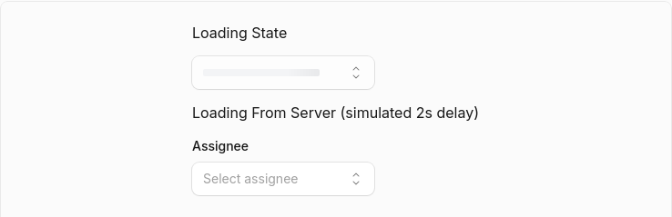
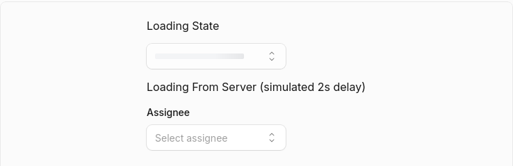
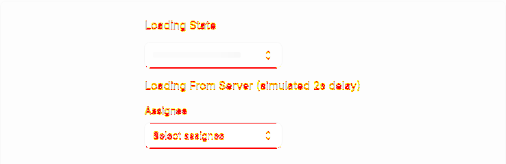
Select / Select Loading2,475 px (1.4%) changed
Select / Select Disabled Options1,700 px (1.92%) changed
Select / Select Disabled Items778 px (0.88%) changed
Select / Select Grouped105 px (0.12%) changed
Select / Select Grouped With Disabled1,609 px (1.82%) changed
Select / Select Long List1,918 px (1.84%) changed
Select (Open)0 px (0%) changed
17 screenshot(s) unchanged
Generated by Kumo Visual Regression |







































































…t corners

- Remove vertical orientation; ButtonGroup is horizontal-only
- Fix seam jumping on hover: only lift z-index on keyboard focus, never on
  hover, so the shared 1px seam stays put (later sibling paints on top)
- Make corner rounding robust to runtime-injected elements (dropdown popup /
  backdrop / focus guards) by scoping the join selectors to button/a via
  :*-of-type, so outer corners stay rounded when a menu opens
…ne control

Each kumo Button ships its own shadow-xs. Inside a group those drop shadows
overlap at the seams, making the middle button look elevated/boxed and leaving
a clipped-corner artifact on its trailing edge. Drop child shadows within the
group; the shared rings provide all the definition needed.
… dark box

Root cause of the boxed/dark middle segment: kumo's Button draws a near-black
ring on *any* focus (focus:ring-kumo-focus/50), including mouse clicks. Inside a
segmented group that renders as a jarring dark box on the clicked segment.

- Reset the ring to the resting line color for mouse focus
  (:focus:not(:focus-visible)); the fill/selected state is the feedback
- Keep the keyboard focus-visible ring (lifted) for a11y

Verified in a real browser across resting / hover / mouse-click / keyboard-focus
for the segmented control, the primary split button (incl. open dropdown), and
the icon toolbar.

 mattrothenberg
left a comment
mattrothenberg
left a comment
mattrothenberg
left a comment
There was a problem hiding this comment.
Love this. We should probably use Base UI's Toolbar primitive here, no? https://base-ui.com/react/components/toolbar

 ArshVermaGit
left a comment
ArshVermaGit
left a comment
ArshVermaGit
left a comment
There was a problem hiding this comment.
Looks good to me. The component is implemented cleanly, with clear docs, demos, and test coverage. It fits well with the existing component library. LGTM.
3 participants


Summary
Adds a
ButtonGroupcomponent that visually joins related buttons into a single segmented control — action rows, icon toolbars, and split buttons (a primary action next to a dropdown trigger).Motivated by a hand-rolled split-button snippet that flattened corners manually and used raw Tailwind colors (
border-blue-700 dark:border-blue-600), which violate kumo's styling rules.ButtonGroupmakes this a first-class, reusable component built entirely on semantic tokens.Design
variant,size, andshape. The group flattens inner corners and overlaps borders (-1px) so adjacent buttons share a single seam — the seam color comes from each button's own ring, so it works for every variant without hardcoded colors.horizontal(default) andvertical.role="group"by default, overridable (e.g.role="toolbar"witharia-label). Interacted buttons lift viaz-indexso focus rings aren't clipped by the overlap.dark:— passes the custom color lint.What's included
KUMO_BUTTON_GROUP_VARIANTS,_DEFAULT_VARIANTS,_STYLING),forwardRef,displayName/components/button-group) with 6 demos (basic, split button, icon toolbar, icons+labels, vertical, sizes)Action) + changeset (minor)Testing
pnpm --filter @cloudflare/kumo test button-group→ 9/9 passpnpm --filter @cloudflare/kumo typecheck→ cleanpnpm --filter @cloudflare/kumo lint→ no button-group issuespnpm --filter @cloudflare/kumo build+ docs build (72 pages, button-group page renders)Reviews
bonk has reviewed the change
automated review not possible because: new component with visual/interaction behavior best verified by a human in the preview link
Tests
Tests included/updated