| jupytext |
|
||||||||||
|---|---|---|---|---|---|---|---|---|---|---|---|
| kernelspec |
|
Xarray advanced
DS Python for GIS and Geoscience
October, 2025© 2025, Joris Van den Bossche and Stijn Van Hoey. Licensed under CC BY 4.0 Creative Commons
+++
Acknowledgments to the data service: https://cds.climate.copernicus.eu/cdsapp#!/dataset/reanalysis-era5-land-monthly-means?tab=overview
import xarray as xr
import numpy as np
import matplotlib.pyplot as plt

import cmocean
+++
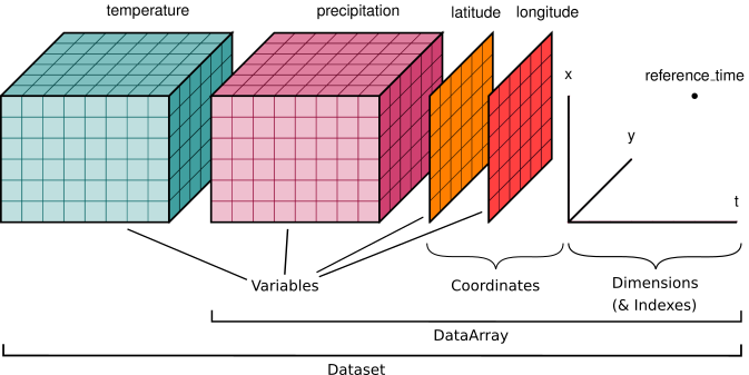
We already know xarray.DataArray, it is a single multi-dimensional array and each dimension can have a name and coordinate values. Next to the DataArray, xarray has a second main data structure to store arrays, i.e. xarray.DataSet.
Let's read an xarray data set (global rain/temperature coverage stored in the file 2016-2017_global_rain-temperature.nc), using the function open_dataset:
ds = xr.open_dataset("./data/2016-2017_global_rain-temperature.nc", engine="netcdf4")
ds
REMEMBER:
xarray provides reading function for different formats with the open_dataset and open_dataarray functions. For GIS formats such as geotiff and other GDAL readable raster data, the rasterio engine (engine="rasterio") is available after the installation of rioxarray. NetCDF-alike data formats can also be loaded using the open_dataset() function using a NetCDF-compatible engine, e.g. netcdf or h5netcdf. The netcdf-engine will be guessed by default.
+++
Let's take a closer look at this xarray.Dataset:
- A
xarray.Datasetis the second main data type provided by xarray - This example has 3 dimensions:
y: the y coordinates of the data setx: the x coordinates of the data setyear: the year coordinate of the data set
- Each of these dimensions are defined by a coordinate (1D) array
- It has 2 Data variables:
precipitationandtemperaturethat both share the same coordinates
Hence, a Dataset object stores multiple arrays that have shared dimensions (Note: not all dimensions need to be shared). It is designed as an in-memory representation of the data model from the netCDF file format.
ds["temperature"].shape, ds["temperature"].dims
The data and coordinate variables are also contained separately in the data_vars and coords dictionary-like attributes of a xarray.DataSet to access them directly:
- The data variables:
ds.data_vars
- The data coordinates:
ds.coords
If you rather use an alternative name for a given variable, use the rename method:
ds.rename({"precipitation": "rain"})
Note: the renaming is not entirely correct as rain is just a part of all precipitation (see https://en.wikipedia.org/wiki/Precipitation).
+++
Adding new variables to the data set is very similar to Pandas/GeoPandas:
ds["precipitation_m"] = ds["precipitation"]/1000.
ds
+++
Each of the data variables can be accessed as a single xarray.DataArray similar to selecting from dictionaries or columns from DataFrames:
type(ds["precipitation"]), type(ds["temperature"])
One can select multiple variables at the same time as well by passing a list of variable names:
ds[["temperature", "precipitation"]]
Or the other way around, use the drop_vars to drop variables from the data set:
ds.drop_vars("temperature")
NOTE:
Selecting a single variable using [] results into a xarray.DataArray, selecting multiple variables using a list [[..., ...]] results into a xarray.DataSet. Using drop_vars always returns a xarray.DataSet.
+++
The selection with sel works as well with xarray.DataSet, selecting the data for all variables in the DataSet and returning a DataSet:
ds.sel(year=2016)
The inverse of the sel method is the drop_sel which returns a DataSet with the enlisted indices removed:
ds.drop_sel(year=[2016])
+++
Plotting for data set level is rather limited. A typical use case that is supported to compare two data variables are scatter plots:
ds.plot.scatter(x="temperature", y="precipitation", s=1, alpha=0.1, edgecolor="none")
facetting is also supported here, by linking the col or row parameter to a data variable.
ds.plot.scatter(x="temperature", y="precipitation", s=1, alpha=0.1, col="year", edgecolor="none") # try also hue="year" instead of col; requires hue_style="discrete"
+++
Datasets support arithmetic operations by automatically looping over all data variables and supports most of the same methods found on xarray.DataArray:
ds.mean()
ds.max(dim=["x", "y"])
Note Using the names of the data variables (which is actually element-wise operations with DataArrays) makes a calculation very self-describing, e.g.
(ds["temperature"] * ds["precipitation"]).sel(year=2016).plot.imshow()
+++
For the next set of exercises, we use the ERA5-Land monthly averaged data, provided by the ECMWF (European Centre for Medium-Range Weather Forecasts).
ERA5-Land is a reanalysis dataset providing a consistent view of the evolution of land variables over several decades. Reanalysis combines model data with observations from across the world into a globally complete and consistent dataset using the laws of physics.
For these exercises, a subset of the data set focusing on Belgium has been prepared, containing the following variables:
sf: Snowfall (m of water equivalent)sp: Surface pressure (Pa)t2m: 2 metre temperature (K)tp: Total precipitation (m)u10: 10 metre U wind component (m/s)
The dimensions are the longitude, latitude and time, which are each represented by a corresponding coordinate.
era5 = xr.open_dataset("./data/era5-land-monthly-means_example.nc") # engine="netcdf4" is here optional
era5
To get a feeling on the spatial subset of the data set for these exercises, the following code creates a cartopy map of the average temperature with country borders added:
import cartopy
import cartopy.crs as ccrs

fig = plt.figure(figsize=(9,6))
ax = plt.axes(projection=ccrs.PlateCarree())

ax.add_feature(cartopy.feature.BORDERS, linestyle=':')
era5_mean_temp = era5["t2m"].mean(dim="time") - 273.15
era5_mean_temp.plot.imshow(ax=ax, cmap="coolwarm",
                           transform=ccrs.PlateCarree(),
                           cbar_kwargs={'shrink': 0.65});
(See notebook visualization-03-cartopy for more information on the usage of Cartopy)
+++
EXERCISE:
The short names used by ECMWF are not very convenient to understand. Rename the variables of the data set according to the following mapping:
sf: snowfall_msp: pressure_pat2m: temperature_ktp: precipitation_mu10: wind_ms
Save the result of the mapping as the variable era5_renamed.
Hints
- Both
renameandrename_varscan be used to rename the DataSet variables - The
renamefunction requires adict-likeinput with the current names as the keys and the new names as the values.
mapping = {
    "sf": "snowfall_m",
    "sp": "pressure_pa",
    "t2m": "temperature_k",
    "tp": "precipitation_m",
    "u10": "wind_ms"
}
:tags: [nbtutor-solution]

era5_renamed = era5.rename(mapping)
era5_renamed
Note: Make sure you have the variable era5_renamed correctly loaded for the following exercises. If not, load the solution of the previous exercise.
+++
EXERCISE:
Start from the era5_renamed variable. You are used to work with temperatures defined in degrees celsius instead of Kelvin. Add a new data variable to era5_renamed, named temperature_c, by converting the temperature_k into degrees celsius:
Create a histogram of the temperature_c to check the distribution of all the temperature valus in the data set. Use an appropriate number of bins to draw the histogram.
Hints
- Xarray - similar to Numpy - applies the mathematical operation element-wise, so no need for loops.
- Most plot functions work on
DataArray, so make sure to select the variable to apply the.plot.hist(). - One can define the number of bins using the
binsparameter in thehistmethod.
:tags: [nbtutor-solution]

era5_renamed["temperature_c"] = era5_renamed["temperature_k"] - 273.15
:tags: [nbtutor-solution]

era5_renamed["temperature_c"].plot.hist(bins=50);
EXERCISE:
Calculate the total snowfall of the entire region of the dataset in function of time and create a line plot showing total snowfall in the y-axis and time in the x-axis.
Hints
- You need to calculate the total (
sum) snowfall (snowfall_m) in function of time, i.e. aggregate over both thelongitudeandlatitudedimensions (dim=["latitude", "longitude"]). - As the result is a DataArray with a single dimension, the default
plotwill show a line, but you can be more explicit by saying.plot.line().
:tags: [nbtutor-solution]

era5_renamed["snowfall_m"].sum(dim=["latitude", "longitude"]).plot.line(figsize=(18, 5))
EXERCISE:
The speed to sound is linearly dependent on temperature:
with
Add a new variable to the era5_renamed data set, called speed_of_sound_m_s, that calculates for each location and each time stamp in the data set the temperature corrected speed of sound.
Create a scatter plot to control the (linear) relationship you just calculated by comparing all the speed_of_sound_m_s and temperature_c data points in the data set.
Hints
- Creating a new variable is similar to GeoPandas/Pandas/dictionaries,
ds["MY_NEW_VAR"] = .... - Remember, calculations are element-wise just as in Numpy/Pandas; so no need for loops. The numbers (331.5, 0.6) are broadcasted to all elements in the data set to do the calculation.
- To compare two variables in a data set visually,
plot.scatter()it is.
:tags: [nbtutor-solution]

era5_renamed["speed_of_sound_m_s"] = 331.5 + (0.6*era5_renamed["temperature_c"])
:tags: [nbtutor-solution]

era5_renamed.plot.scatter(x="temperature_c", y="speed_of_sound_m_s")
+++
Let's start again from the ERA5 data set we worked with in the previous exercises, and rename the variables for convenience:
era5 = xr.open_dataset("./data/era5-land-monthly-means_example.nc")
mapping = {
    "sf": "snowfall_m",
    "sp": "pressure_pa",
    "t2m": "temperature_k",
    "tp": "precipitation_m",
    "u10": "wind_ms"
}
era5_renamed = era5.rename(mapping)
era5_renamed
Apart from the different coordinates, the data set also contains a time dimension. xarray borrows the indexing machinery from Pandas, also for datetime coordinates:
era5_renamed.time
With a DateTime-aware index (see datetime64[ns] as dtype), selecting dates can be done using the string representation, e.g.
era5_renamed.sel(time="2002").time
era5_renamed.sel(time=slice("2001-05", "2002-08")).time
And you can access the datetime components, e.g. "year", "month",..., "dayofyear", "week", "dayofweek",... but also "season". Do not forget to use the .dt-accessor to access these components:
era5_renamed["time"].dt.season
Xarray contains some more powerful functionalities to work with time series, e.g. groupby, resample and rolling. All have a similar syntax as Pandas/GeoPandas, but applied on an N-dimensional array instead of a DataFrame.
+++
+++
If we are interested in the average over time for each of the levels, we can use a reducton function to get the averages of each of the variables at the same time:
era5_renamed.mean(dim=["time"])
But if we wanted the average for each month of the year per level, we would first have to split the data set in a group for each month of the year, apply the average function on each of the months and combine the data again.
We already learned about the split-apply-combine approach when using Pandas. The syntax of Xarray’s groupby is almost identical to Pandas!
+++
First, extract the month of the year (1 -> 12) from each of the time coordinate/dimension:
era5_renamed["time"].dt.month # The coordinates is a Pandas datetime index
We can use this array in a groupby operation:
era5_renamed.groupby(era5_renamed["time"].dt.month)
split the data in (12) groups where each element is grouped according to the month it belongs to.
+++
Note: Xarray also offers a more concise syntax when the variable you're grouping on is already present in the dataset. The following statement is identical to the previous line:
era5_renamed.groupby("time.month")
Next, we apply an aggregation function for each of the months over the time dimension in order to end up with: for each month of the year, the average (over time) for each of the levels:
era5_renamed.groupby("time.month").mean()
The resulting dimension month contains the 12 groups on which the data set was split up.
+++

+++
REMEMBER:
The groupby method splits the data set in groups, applies some function on each of the groups and combines again the results of each of the groups. It is not limited to time series data, but can be used in any situation where the data can be split up by a categorical variable.
+++
+++
Another (alike) operation - specifically for time series data - is to resample the data to another time-aggregation. For example, resample to monthly (4M) or yearly (1Y) median values:
era5_renamed.resample(time="1YE").median() # 4M
era5_renamed["temperature_k"].sel(latitude=51., longitude=4., method="nearest").plot.line(x="time");
era5_renamed["temperature_k"].sel(latitude=51., longitude=4., method="nearest").resample(time="10YE").median().plot.line(x="time");
A similar, but different functionality is rolling to calculate rolling window aggregates:
era5_renamed.rolling(time=12, center=True).median()
era5_renamed["temperature_k"].sel(latitude=51., longitude=4., method="nearest").plot.line()
era5_renamed["temperature_k"].sel(latitude=51., longitude=4., method="nearest").rolling(time=12, center=True).min().plot.line()
era5_renamed["temperature_k"].sel(latitude=51., longitude=4., method="nearest").rolling(time=12, center=True).max().plot.line()
REMEMBER:
The xarray groupby with the same syntax as Pandas implements the split-apply-combine strategy. Also resample and rolling are available in xarray.
Note: Xarray adds a groupby_bins convenience function for binned groups (instead of each value).
+++
+++
Run this cell before doing the exercises, so the starting point is again the era5_renamed data set:
era5 = xr.open_dataset("./data/era5-land-monthly-means_example.nc")
mapping = {
    "sf": "snowfall_m",
    "sp": "pressure_pa",
    "t2m": "temperature_k",
    "tp": "precipitation_m",
    "u10": "wind_ms"
}
era5_renamed = era5.rename(mapping)
EXERCISE:
Select the pressure data for the pixel closest to the center of Ghent (lat: 51.05, lon: 3.71) and assign the outcome to a new variable ghent_pressure.
Define a Matplotlib Figure and Axes (respectively named fig, ax) and use it to create a plot that combines the yearly average of the pressure data in Gent with the monthly pressure data as function of time for that same pixel as line plots. Change the name of the y-label to 'Pressure (Pa)' and the title of the plot to 'Pressure (Pa) in Ghent (at 51.05, 3.71)' (see notebook visualization-01-matplotlib.ipynb for more information)
Hints
- For the yearly average, actually both
resample(time="Y")asgroupby("time.year")can be used. The main difference is the returned dimension after the grouping:resamplereturns a DateTimeIndex, whereasgroupbyreturns a dimension calledyearand no longer contains the DateTimeIndex. To combine the data with other time series data, using the DateTimeIndex is preferred (i.e.resample). fig, ax = plt.subplots()is a useful shortcut to prepare a Matplotlib Figure. You can add a labelset_label()and titleset_title()to theaxesobject.
:tags: [nbtutor-solution]

ghent_pressure = era5_renamed.sel(latitude=51.05, longitude=3.71, method="nearest")["pressure_pa"]

fig, ax = plt.subplots(figsize=(18, 6))
ghent_pressure.plot.line(ax=ax)
ghent_pressure.resample(time="YE").mean().plot.line(ax=ax)

ax.set_ylabel('Pressure (Pa)')
ax.set_title('Pressure (Pa) in Ghent (51.05, 3.71)')
EXERCISE:
Select the precipitation data for the pixel closest to the center of Ghent (lat: 51.05, lon: 3.71) and assign the outcome to a new variable ghent_precipitation.
For the Ghent pixel, calculate the maximal precipitation for each month of the year (1 -> 12) and convert it to mm precipitation.
To make a bar-chart (not supported in xarray) of the maximal precipitation for each month of the year, convert the output to a Pandas DataFrame using the to_dataframe() method and create a horizontal bar chart with the month in the y-axis and the maximal precipitation in the x-axis. Feel free to improve the axis labels.
Hints
- You need to group based on the month of the data point, hence
groupby("...")withtimeas an existing dimension, thetime.monthshortcut to get the corresponding month will work. - Plotting in Pandas is very similar to xarray, use
.plot.barh()to create a horizontal bar chart.
:tags: [nbtutor-solution]

ghent_precipitation = era5_renamed.sel(latitude=51.05, longitude=3.71, method="nearest")["precipitation_m"]
ghent_precipitation_month_max = ghent_precipitation.groupby("time.month").max()*1000

fig, ax = plt.subplots()
ghent_precipitation_month_max.to_dataframe()["precipitation_m"].plot.barh(ax=ax)
ax.set_xlabel("Maximal monthly precipitation (mm)")
ax.set_ylabel("Month of the year")
EXERCISE:
Calculate the pixel-based average temperature for each season. Make a plot (imshow) with each of the seasons in a separate subplot next to each other.
Hints
- You need to group based on the season of the data point, hence
groupby("...")withtimeas an existing dimension, thetime.seasonshortcut to get the corresponding season will work. - The labels of the season groups are sorted on the strings in the description instead of the seasons. The workaround is to
reindexand provide a correctly sorted (i.e.['DJF','MAM','JJA', 'SON']version to sort theseasonwith. - Use facetting to plot each of the seasons next to each other, with
col="season".
:tags: [nbtutor-solution]

seaons_temp = era5_renamed["temperature_k"].groupby("time.season").mean()
# See https://github.com/pydata/xarray/issues/757 for getting well-sorted groups for plotting
seaons_temp = seaons_temp.reindex(season=['DJF','MAM','JJA', 'SON'])
seaons_temp.plot.imshow(col="season", cmap="Reds")
EXERCISE:
Calculate the average temperature of the entire region of the dataset in function of time. From this time series, use only those years for which all 12 months of the year are included in the data set and calculate the yearly average temperature.
Create a line plot showing the yearly average temperature in the y-axis and time in the x-axis.
Hints
- You need to calculate the average (
mean) temperature in function of time, i.e. aggregate over both thelongitudeandlatitudedimensions. - Year 2021 is only available till June, so exclude the year (e.g. slice till 2020).
- Resample to yearly values.
- As the result is a DataArray with a single dimension, the default
plotwill show a line, but you can be more explicit by saying.plot.line().
:tags: [nbtutor-solution]

temp_mean = era5_renamed["temperature_k"].mean(dim=["latitude", "longitude"]).sel(time=slice("1981", "2020"))
temp_mean.resample(time="YE").mean().plot.line(figsize=(12, 5))
EXERCISE:
Create the yearly total snowfall from 1991 up to 2005 and convert the snowfall into cm. Make a plot (imshow) with each of the individual years in a separate subplot divided into 3 rows and 5 columns.
Make sure to update the name of the snowfall variable and/or colorbar label to make sure it defines the unit in cm.
Hints
- When selecting time series data from a coordinate with datetime-aware data, one can use strings to define a date. In combination with
slice, the selection of the required years becomesslice("1991", "2005"). - From montly to yearly data is a
resampleof the data. - Use
.rename(NEW_NAME)to update the name of aDataArray - xarray supports facetting directly, check out the
colandcol_wrapparameters in the plot functions of xarray or check http://xarray.pydata.org/en/stable/user-guide/plotting.html#faceting. - To update the colorbar unit use, the
cbar_kwargsoption.
:tags: [nbtutor-solution]

snowfall_1991_2005 = era5_renamed.sel(time=slice("1991", "2005"))["snowfall_m"]
snowfall_yearly = snowfall_1991_2005.resample(time="YE").sum()*100
snowfall_yearly = snowfall_yearly.rename("snowfall_cm")
snowfall_yearly.plot.imshow(col="time", col_wrap=5, cmap=cmocean.cm.ice,
                            cbar_kwargs={"label": "snowfall (cm)"})
Values are only read from disk when needed. For example, the following statement only reads the coordinate information and the metadata. The data itself is not yet loaded:
data_file = "./data/2016-2017_global_rain-temperature.nc"
ds = xr.open_dataset(data_file)
load() will explicitly load the data into memory:
xr.open_dataset(data_file).load()
+++
Consider the sentinel images of Gent used in a previous notebook:
gent_file = "./data/gent/raster/2020-09-17_Sentinel_2_L1C_B0408.tiff"
gent_array = xr.open_dataarray(gent_file, engine="rasterio")
gent_array.plot.imshow(col="band")
The data is a xarray.DataArray with 3 dimensions and corresponding coordinates. Assigning the names b4 and b8 to the individual bands, makes the data more self-describing:
gent_array = gent_array.assign_coords(band=("band", ["b4", "b8"]))
gent_array
In case one wants to work with the different bands as DataSet variables instead of a dimension of a single DataArray, the conversion to_dataset can be done, defining the dimension to convert to data set variables, e.g.
gent_ds = gent_array.to_dataset(dim="band")
gent_ds
Consider the calculation of the NDVI for Gent using a xarray DataArray:
ndvi_array = (gent_array.sel(band="b8") - gent_array.sel(band="b4"))/(gent_array.sel(band="b8") + gent_array.sel(band="b4"))
ndvi_array.plot.imshow(cmap="YlGn")
One might find the usage of data variable in this case more convenient, as it provides the ability to:
- work with the variable names directly
- Add the output tot the data set as a new variable
- The output can be converted to an Array again using
to_array
For example:
gent_ds["ndvi"] = (gent_ds["b8"] - gent_ds["b4"])/(gent_ds["b8"] + gent_ds["b4"])
gent_ds.to_array(dim="layer")